Data visualization methods
I just found this fantastic breakdown of different ways to visualize data in a recent article by Sarah Zimmers about data dashboards. I’m always looking for clearest way to communicate insights from complicated data sets, and this chart just hit right.
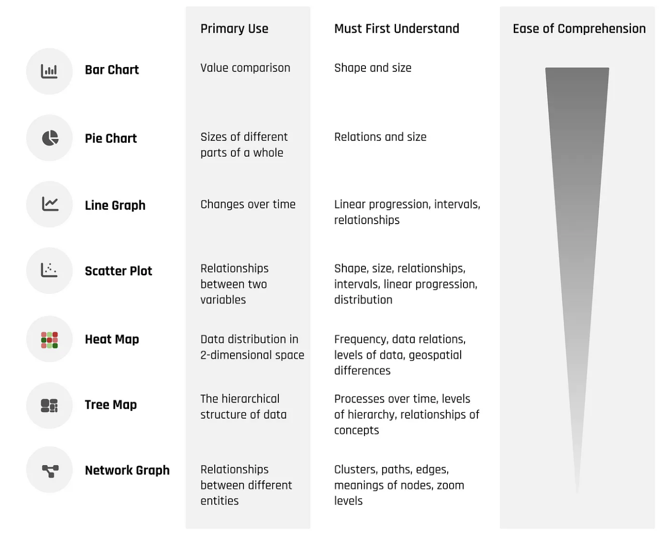
Data visualization types, sorted by ease of comprehension:
- Bar Chart - use to comparing values, readers need to understand shape and size
- Pie Chart - use to demonstrate sizes of different parts of a whole, readers need to understand relationships and sizes
- Line Graph - use to show changes over time, readers need to understand linear progression, intervals, and relationships
- Scatter Plot - use to compare relationships between two variables, readers need to understand shape, size, relationships, intervals, linear progression, and distribution
- Heat Map - used to illustrate a data distribution in 2-dimensional space, readers need to understand frequency, data relations, levels of data, and geospatial differences
- Tree Map - used to show the hierarchical structure of data, readers need to understand process over time, levels of hierarchy, and relationships of concepts
- Network Graph - used to relationships between different entities, readers need to understand clustering, paths, edges, meanings of nodes, and zoom levels
—
Cheers,

Up Next: Death by 1000 meetings
Design Systems Daily
Sign up to get daily bite-sized insights in your inbox about design systems, product design, and team-building:
New to design systems?
Start with my free 30-day email course →