Day 12: Component-based vs. template-based architecture
When I first started in web design, most designers (and many developers) thought in terms of pages. What are the needs of the user and how do I design this page to best address those needs?
The way that the tools used to publish websites (Movable Type, WordPress, etc.) were structured reflected that thinking: home page, 404 page, search page, individual entry template, category archive template.
This isn’t a bad place to start.
It’s a natural way to think about the overall user experience. Good user-centered design should start with a holistic overview of a user’s needs in a given context, and the page is a natural grouping for the web (though some have argued otherwise.)
…
But several things happened that complicated that view.
Mobile devices came along and forced us to think about how content worked on smaller viewports. A paragraph of body copy might look good alongside an image on a wide monitor. On a narrow phone screen, a single column might make more sense.
We had to start thinking about each piece of content atomistically.
- How does this piece adapt as its container changes?
- How does it interact with the other pieces of content on the page?
- What are the rules that govern these changes?
Also, websites began to grow more complex. As the number of pages increased, so did the number of different types of pages and the functionality those pages supported.
This raised some practical questions:
- How do we manage these user interaction points across many pages?
- Can we reuse small pieces of our site so we don’t have to repeat ourselves?
- What if something about these pieces need to change slightly depending on the context in which they appear?
Navigation menus, search fields, and newsletter signup forms were early examples of this need for reusability.
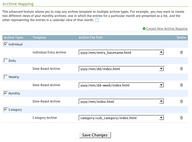
Here’s a simple example from my Practical Design System website:
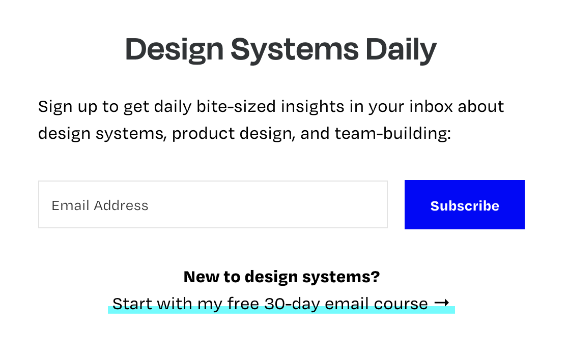
I use this subscription form on different pages of my website, so I put that code together as a reusable component that can be included on any page of my site. I don’t need that call-to-action on my 30-day email course page, so I also built in an option that lets me hide that bit.
Now, imagine me being able to reuse that form on other sites I control. That’s the power and flexibility of component-driven architecture.
…
Designers usually still think in terms of pages. And developers usually still create templates for various types of pages. But the changes I mentioned earlier ultimately led toward a more component-centered view of web development.
That’s why the idea of components in design tools are so useful for design systems: because they’re starting to mirror some the logic and reusability that engineering has supported for a long time.
It can feel a bit constraining, especially if you’re a designer who prefers to start with a blank canvas. And it can often be difficult for stakeholders to think about all the little interface atoms and how they behave with no context. (“Just give me a comp!”)
But helping designers understand the realities and complexities of software development improves alignment and generates better conversations between designers and engineers during the product creation process. I think that’s a good thing.
Tomorrow, we code!
—
Cheers,

Up Next: Day 13: I need products!
Design Systems Daily
Sign up to get daily bite-sized insights in your inbox about design systems, product design, and team-building:
New to design systems?
Start with my free 30-day email course →