Day 17: Exploring the Navigation Component
Yesterday, I pulled Atlassian’s design system into my app and got one of their buttons publishing in my app.
Today, I’m going to try to recreate the Utility Nav component I designed in Figma using one of the Atlassian components.
Check out Atlassian’s component reference site. So much to like. Recognizable thumbnails, a succinct description for each, and an easy-to-scan sidebar nav. The individual component pages show notable examples, engineering integration and properties, code snippets, usage guidelines, a change log, and even a feedback survey for the page’s usefulness.
Oh, and be sure to try the search. 💪
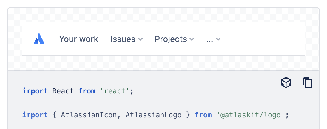
It seems like the Navigation Component might be the closest thing to the Utility Nav I’m looking to create:
When you scan the page, you start to realize that what appears to be a simple component can often be more complicated than meets the eye.
A few things that stand out to me:
- This component is primarily a holder for other components;
- They’ve divided it up into a primary and secondary section;
- They’ve accounted for many use cases, like displaying a home link, adapting to too many menu items on small viewports, using skeleton loaders, and displaying additional items like search, settings, profile avatar, etc.
My use case is pretty simple: display the bar with a few links. (In this case, the links will be button components.)
This example in the documentation is the closest to what I’m trying to accomplish, so I’ll start here:
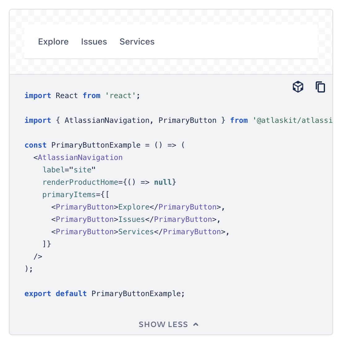
I remember that I needed to yarn add the button component before using it, so I’ll do the same thing here (the exact command is documented in the Code tab). As expected, my package.json file is updated with a new line: "@atlaskit/atlassian-navigation": "^2.8.0" — the Atlassian Navigation component is loaded.
I adapt the instructions to include it in my app’s code:
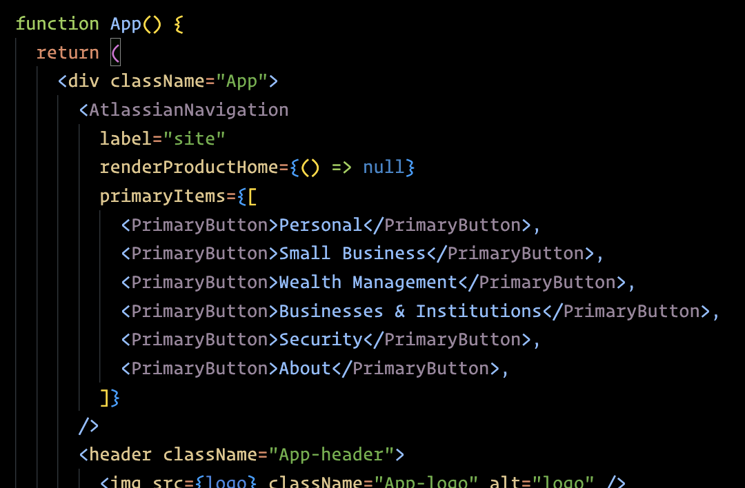
I save, reload, and 💥 this is what shows up at the top of my app:

And because the <PrimaryButton> component extends the <Button> component, I know from the documentation that I can pass in all the attributes the <Button> supports.
I can specify an href attribute with a URL. I can set the attribute appearance="link" to have it display like a link and not like a button. I can even add isSelected to whichever item I want to be the “active” one:

What’s even better is that when I resize the window down to mobile viewport widths, the component handles this gracefully: the items that would spill over are automatically tucked into a dropdown menu.
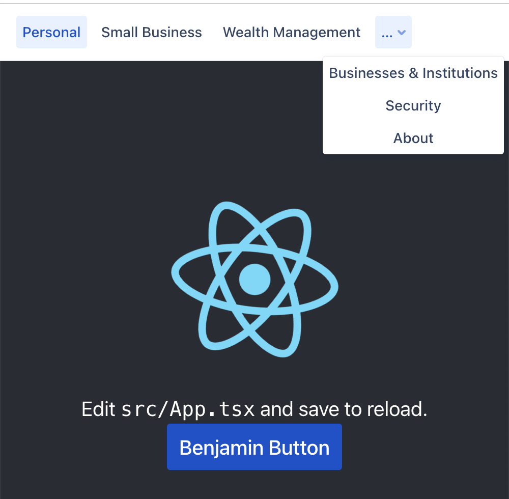
I didn’t have to code any of that…
That’s one of the great benefits of using a design system. Whatever design decisions and behavior has been built-in, I get to use just by pulling it in.
There’s more I could do with this, but I’ll end there.
Tomorrow, I’ll take what I’ve learned from this example and plan out the component I’m going to build.
—
P.S. If you’ve just joined the list, I’m in the middle of a practical design system build. You can catch up at the beginning of the series here.
—
Cheers,

Up Next: Day 18: Planning my new component
Design Systems Daily
Sign up to get daily bite-sized insights in your inbox about design systems, product design, and team-building:
New to design systems?
Start with my free 30-day email course →