Day 19: Building my new component
I started building out my component in the simplest way possible.
In the codebase of my first app, I created a new files: UtilityNav.js
This file renders out the component’s HTML (and can contain props and logic):
import './UtilityNav.css';

function UtilityNav() {
  return (
    <nav className="UtilityNav" role="navigation" aria-label="Top Menu">
      <ul className="UtilityNav-menu" role="menu">
        <li className="UtilityNav-item" role="menuitem"><a href="https://example.com">Personal</a></li>
        <li className="UtilityNav-item" role="menuitem"><a href="https://business.example.com">Small Business</a></li>
        <li className="UtilityNav-item" role="menuitem"><a href="https://wealth.example.com">Wealth Management</a></li>
        <li className="UtilityNav-item" role="menuitem"><a href="https://business.example.com">Businesses & Institutions</a></li>
        <li className="UtilityNav-item" role="menuitem"><a href="https://security.example.com">Security</a></li>
        <li className="UtilityNav-item" role="menuitem"><a href="https://about.example.com">About</a></li>
      </ul>
    </nav>
  );
}

export default UtilityNav;
This is really simple: a nav element containing a unordered list full of anchors as list items.
I import it into App.js and include the component at the top of the page:
import UtilityNav from './UtilityNav';

function App() {
  return (
    <div className="App">
      <UtilityNav />
			...
Voila! It’s now showing up on at the top of my application!
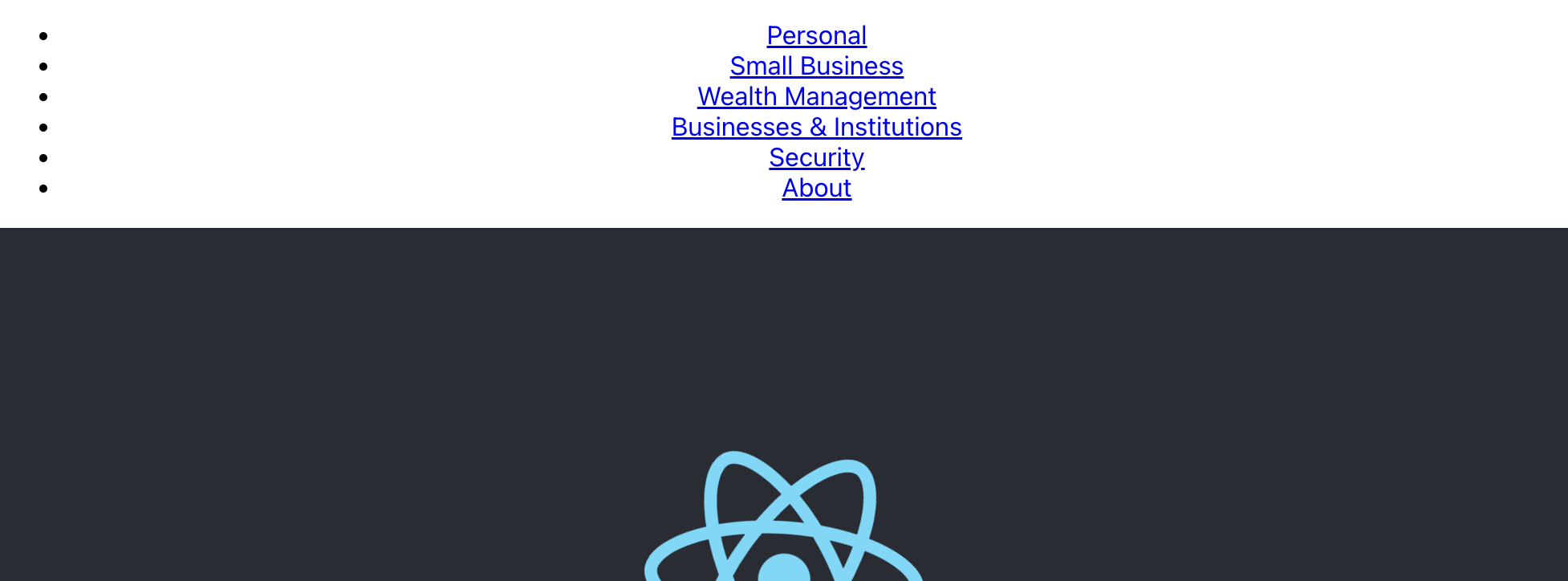
It needs some styling, though.
This brings up an important question to consider when building components for a design system: how should I approach styles? There’s a lot of different ways, each with pros and cons. Which you choose will likely depend on what your org is already doing. I’ll talk about this more in-depth tomorrow.
For now, I’m going to take a simple approach: a component-specific CSS file. I’ll create UtilityNav.css and import it in the header of UtilityNav.js.
.UtilityNav {
  background-color: #F2F2F2;
  margin: 0 auto;
}
.UtilityNav ul {
  font-size: 14px;
  display: flex;
  flex-direction: row;
  justify-content: flex-start;
  align-items: center;
  gap: 2rem;
  width: 100%;
  max-width: 1280px;
  margin: 0 auto;
  padding: 0.5rem 1.5rem;
  list-style: none;
}
.UtilityNav a {
  display: inline-block;
  color: #0b0b0b;
  text-decoration: none;
}
.UtilityNav a:hover,
.UtilityNav a:focus,
.UtilityNav a:active {
  text-decoration: underline;
}
Bringing this up in the app, it’s looks really good:

Can you start to imagine some of the design questions?
I’m hard-coding color values. I’m forcing specific link color and behaviors. Wouldn’t it be better if these values were pulled in from a central library? Wouldn’t it be better if links behaved consistent with all links across the product ecosystem? What happens when I resize this down to mobile? How can individual products identify an item as active?
These are all questions that need to be answered before I can share this with other product teams.
Tomorrow, I’ll spend a bit more time talking about how to approach styling.
—
P.S. If you’ve just joined the list, I’m in the middle of a practical design system build. You can catch up at the beginning of the series here.
—
Cheers,

Up Next: Day 20: 5 ways to style components
Design Systems Daily
Sign up to get daily bite-sized insights in your inbox about design systems, product design, and team-building:
New to design systems?
Start with my free 30-day email course →