Day 27: Setting up Storybook
Installing Storybook is relatively straightforward.
As I mentioned yesterday, I’m setting this up in my shared component library, so I simple went to my bofa-components folder and ran npx storybook@latest init.
I ran into trouble at first. It supports a surprising number of frameworks out-of-the-box, but because I had gone with such a simple initial setup for my component library, it wasn’t able to automatically detect what framework I was using. I selected webpack-react though, and everything worked fine after that.
When I run npm run storybook the first time, this local Storybook view popped up in a browser:
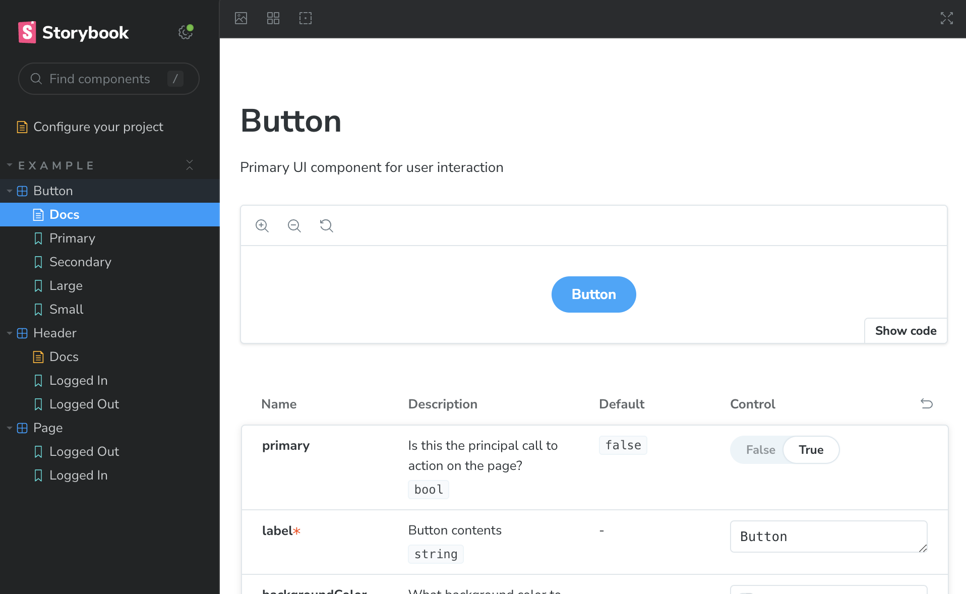
I don’t see the UtilityNav component yet because I haven’t written a story for it. But the Storybook initialization created several sample components, stories, and doc pages. They’re helpful to review if this is your first time through, but I’ll remove them and create a new story file.
Here’s the simplest version of the story:
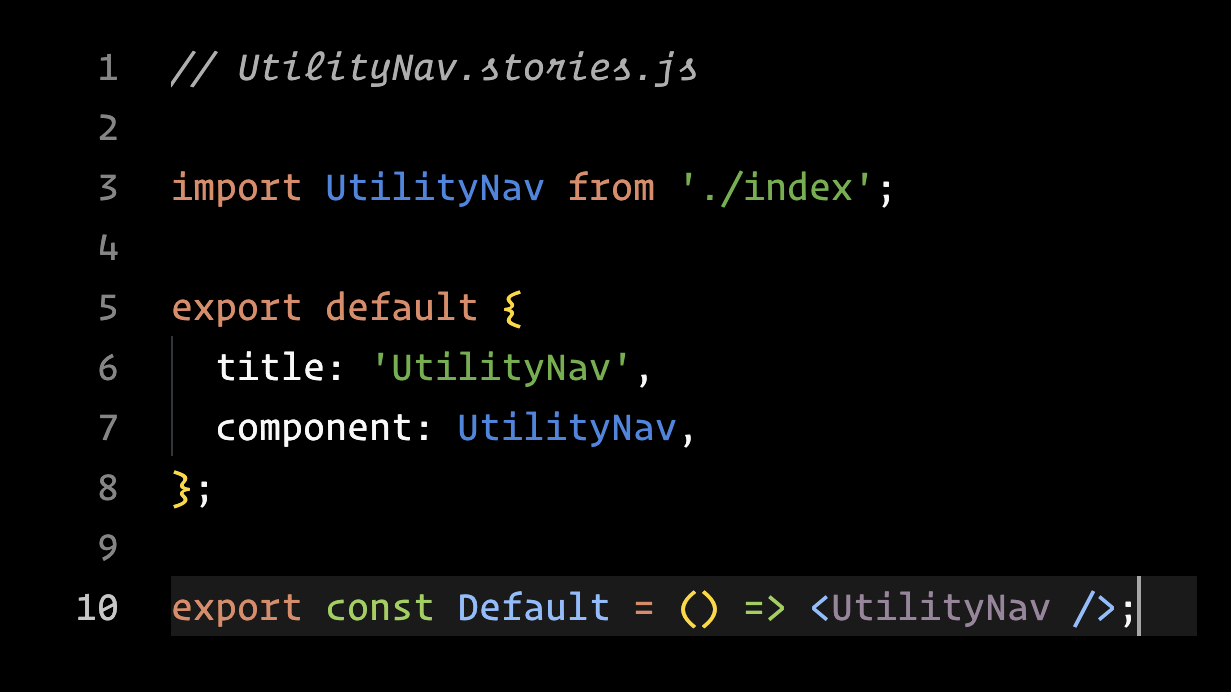
The story is simple: I’m importing the component and exporting it with a “Default” label. I’m not even passing the activeItem property.
The filename is UtilityNav.stories.js and it lives alongside the component file. Storybook is looking for any files that match ../src/**/*.stories.@(js|jsx|mjs|ts|tsx) — that’s how it finds story files.
When I run Storybook again, this is what I see:
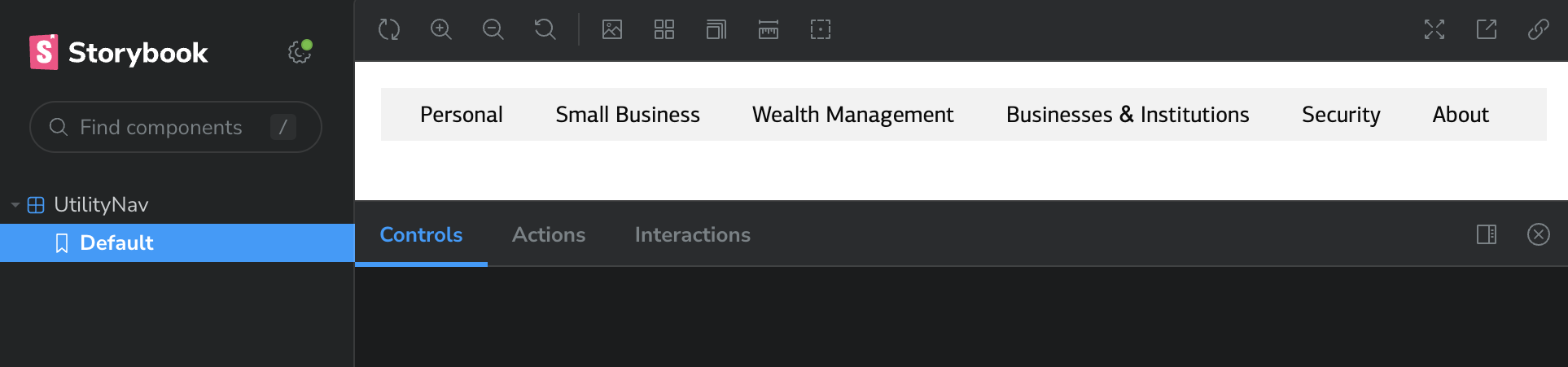
My UtilityNav component is listed in the sidebar, with the Default story I defined, below it. And there’s my component, displayed as it would in any app, only in this isolated development environment.
Success! 🎉
This is good, but I need to take care of something important. Engineers using this component really needs to know about the activeItem prop. That’s how they’ll set the active state for their particular product.
I could list out each option as an individual story:
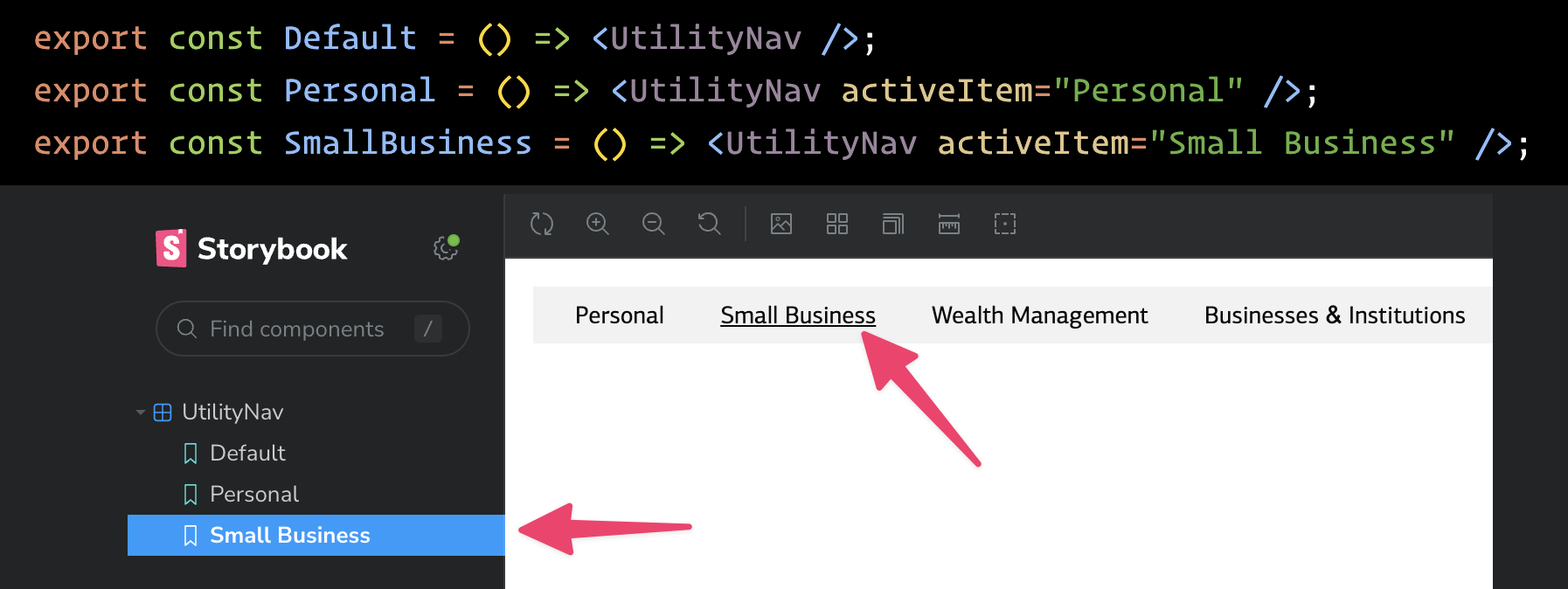
But I want to take a more elegant approach. I’m going to use Storybook’s arg functionality to show those options as as dropdown on the controls panel:
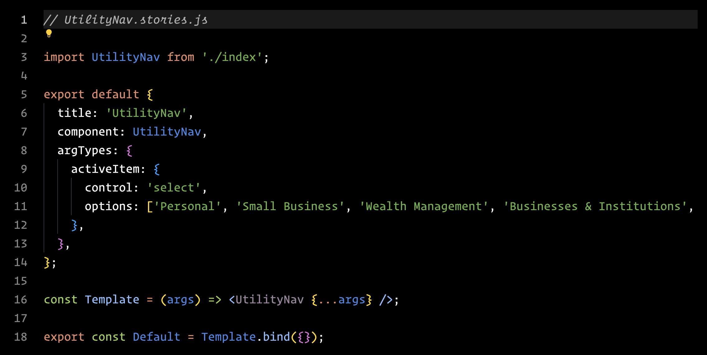
By defining argTypes and passing in the options to a select control, Storybook now lets users select the items from a dropdown and see the component’s activeItem updated:
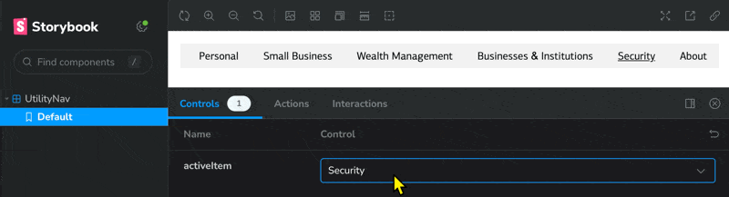
This approach makes it easy for me to add/remove items. It will also be helpful if I ever decide to move away from hard-coding these items.
Now that I’ve got a story set up for my component, I should create some documentation to explain how to import the library and how to use components in existing products.
More on that tomorrow!
—
P.S. If you’ve just joined the list, I’m in the middle of a practical design system build. You can catch up at the beginning of the series here.
—
Cheers,

Up Next: What is “The Question?”
Design Systems Daily
Sign up to get daily bite-sized insights in your inbox about design systems, product design, and team-building:
New to design systems?
Start with my free 30-day email course →