Day 30: Role-playing collaboration
Remember how I shared the public BofA Storybook instance yesterday?
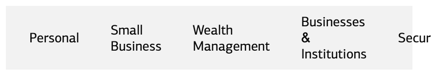
Leadership saw it and noticed that the UtilityNav component didn’t respond nicely on small screens. It gets all bunched up like this:
It sucks that it’s not working, especially since that’s something I should have tested. But the good news is that the reference site is working as it should: we've made it easy for people all over the org to understand and evaluate reusable parts of the interface.
That’s something I should have tested, but it’s odd that I didn’t notice that behavior on the actual products. After talking with the engineering teams, I solved the puzzle. They had noticed and put a band-aid the problem by hiding the component with CSS at smaller breakpoints. Understandable and pragmatic, but not ideal. The component should handle smaller screen sizes out-of-the-box.
I had a call with engineers from each product team and proposed an update to the component so it collapses to an expandable menu with a hamburger button. But one of the engineers said their product already has a hamburger button, so creating a second one would be problematic on their product. They would prefer just to hide it.
After some discussion, we decide the best path forward is to make it responsive by default, but add a “Hide” prop so engineerings can have more control over which version they use on their sites.
I go away and spend a day or two fixing it and adding the hide prop to the component. I add a new story to the Storybook page for this component to document how it works (default state, etc.) I commit my changes, run an npm version patch to increase the version, and npm publish to publish the latest version.
Then what?
Thankfully, when I was doing my initial collaboration with engineering to get the component library into the various products, I had created a #designsystem channel in Slack and invited the engineering managers to it to coordinate efforts around deployment.
This seems like an ideal spot for release updates. I post a Slack message like: “Version 0.1.12 has just been released. Changes include…” with a link to the release in GitHub and an easy-to-scan summary of the changes I’ve made. I make sure to call out the new prop, since that’s something they may need to explicitly set. I also remind them to remove the CSS they’re using to hide it on mobile.
If this were a more advanced release, I would probably set up a demo session to walk everyone through the new features and answer any questions. It's simple, so release notes should be enough.
From there engineers will test the changes in dev — is everything working as expected? If all is well, they’ll merge it into the main branch, ready for the next production update.
This whole scenario really highlights a reality I hope you're catching on to: a design systems team need to collaborate continuously with engineering teams.
Now that we've built out a useful Storybook instance and have practiced using it as part of our design → engineering workflow, there's only one more piece of our practical design system build: tokens.
I'm going to start that on Monday of next week, but you can expect a few emails not in the series between now and then.
—
P.S. If you’ve just joined the list, I’m in the middle of a practical design system build. You can catch up at the beginning of the series here.
—
Cheers,

Up Next: Thank you.
Design Systems Daily
Sign up to get daily bite-sized insights in your inbox about design systems, product design, and team-building:
New to design systems?
Start with my free 30-day email course →