Day 9: Conveying state with variants
I did some component-ception yesterday: I created a Nav Item component and used it to fill up my Utility Nav component. It felt like a roundabout way of accomplishing the same end result, but today I’ll show you some of the flexibility for representing state that setup work gives me.
The only state I noticed while doing my initial content inventory was that active (current) page was underlined. I’ll start simply by recreating that with a variant.
A 'variant' is an instance property. In other words, you can define a property of your component that points to additional versions or styles of that component. Variants makes it easier to organize and choose the specific version you need without poking around a lot of separate items. Think of a primary, secondary, and disabled button — essentially, they’re all the same component, with only slight style changes to convey their distinct state.
To create the variant, I right-clicked the Nav Item component and selected Main Component → Add Variant. When I did, several things happened:
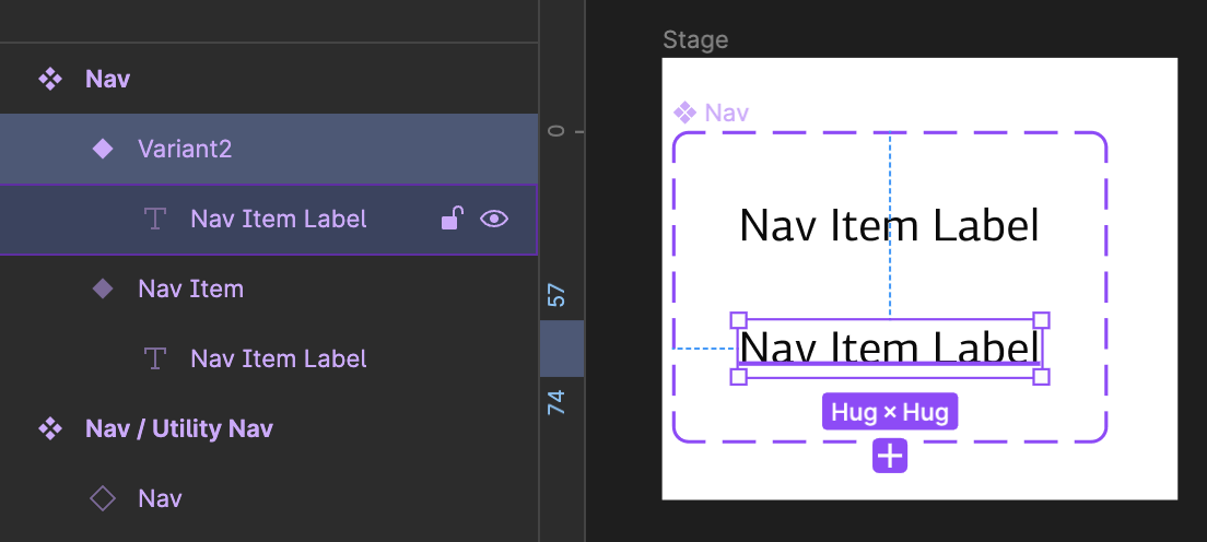
For starters, a weird dashed purple line popped into existence.
And the component name changed to Nav. I’ll change that back to Nav / Nav Item to keep things consistent and restore grouping in the Assets panel.
Also, what looks like a duplicate component appeared below the one I had selected. If you look at the layers, it’s not a duplicate component — there are now two layers with a solid diamond icons.
Let’s review:
- ❖ → Master component — The original version of a design element. Think of it as the parent component. Any changes to this master component is updated in copies or instances.
- ⬦ → Component instance — Copies or children of the master component that can be placed in designs and updated without affecting the master. Updates to the master component will get updated in all instances, unless a specific property has been overridden in the instance.
- ⬥ → Component variant — A special property of a master component that allows grouping different versions of a component within one master.
This new layer is actually a new variant, created from a copy of the component. It assigned the original the name from the master, and it named the copy Variant2. If you select the master component and look in the right sidebar, you’ll notice a new property under Properties: Property 1. It has two values: Nav Item and Variant 2.
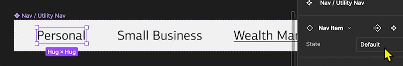
I’ll change Property 1 to State (double-click the name property name in the right sidebar) since that’s what I’ll be using these variants to represent. I’ll select the Nav Item variant and change its name to Default. And I’ll change Variant2 to Active.
Here we come to the flexible bit. I can make any changes I want to this active state: style changes, additional layers and properties, and even component instances. For now, I’m going super simple: my active state will have an underline.
Now, any of the instances of Nav Item can have their state set to Active, and any of the additional styles, layers, and properties defined there will be displayed. That means if I presented this to the team and they decided that, say, the nav item would look better with a solid line bottom-aligned, I could just add that element to the variant.
I’d say Utility Nav is about done, but in the interest of giving you a thorough understanding of components, I’m going to tackle a few props tomorrow to demonstrate some additional flexibility.
Until then… please hit reply and let me know if you’ve got any questions!
—
P.S. If you’ve just joined the list, I’m in the middle of a practical design system build. You can catch up at the beginning of the series here.
—
Cheers,

Design Systems Daily
Sign up to get daily bite-sized insights in your inbox about design systems, product design, and team-building:
New to design systems?
Start with my free 30-day email course →