Grading government UX
The federal government has been partnering with state government to help improve the customer experience for digital products, focusing on sites and applications where residents apply for critical benefits, like Medicade, SNAP, WIC, etc.
As part of that initiative, Code for America recently announced a research project they’ve been working on called The Benefits Enrollment Field Guide.
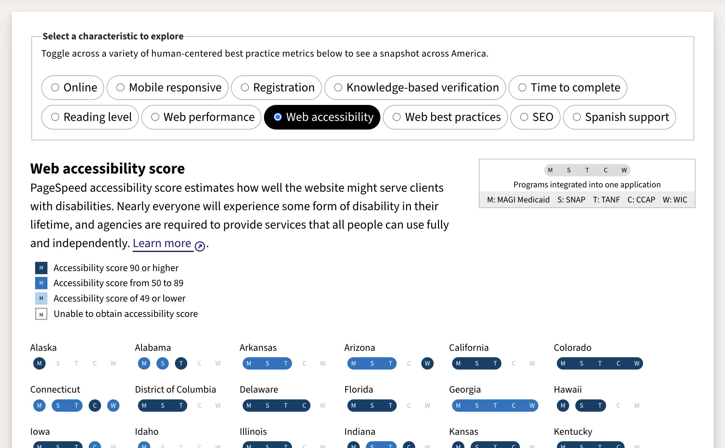
They created a list of best practice metrics centered on human-centered design, and used it to evaluate the benefit enrollment process for each of the 50 US states.
They considered characteristics like:
- Is it online?
- Is it mobile responsive?
- Does it require registration up front (vs. later)?
- Do users need knowledge-based verification to prove identity?
- How long does it take to complete?
- What reading level is the language on the site?
- How quickly does the site load?
- How accessible is the site to those with disabilities?
- Does it follow web best practices?
- How well is the site optimized for indexing by search engines?
- Does the site provide Spanish support?
I encourage you to check it out. The data is interesting enough, but the way its all put together is a masterclass in telling compelling stories with data.
The report highlights trends, celebrating things that have been improving and calling out persistent challenges. I especially like how characteristics that might be less understood (e.g. knowledge-based verification) are explained in detail with supporting research, as if the authors anticipated potential questions or confusion.
The “field guide” near the top compares enrollments for all measured services across all states. For those who want a deeper dive, there’s a “score card” below that goes into great detail about the characteristics that were evaluated and the methodologies that were used, with screenshots and everything.
I know this isn’t directly related to design systems, but I’m convinced that good user research is the backbone for effective design systems. And it doesn’t much get better than this.
—
Cheers,

Up Next: Building sandcastles alone
Design Systems Daily
Sign up to get daily bite-sized insights in your inbox about design systems, product design, and team-building:
New to design systems?
Start with my free 30-day email course →
