How Ford names variables...
Yesterday, I talked about how important it was to keep design systems useful by not making things too complex. I came across this slide in Zeroheight’s 2023 report on how people use and document design systems:
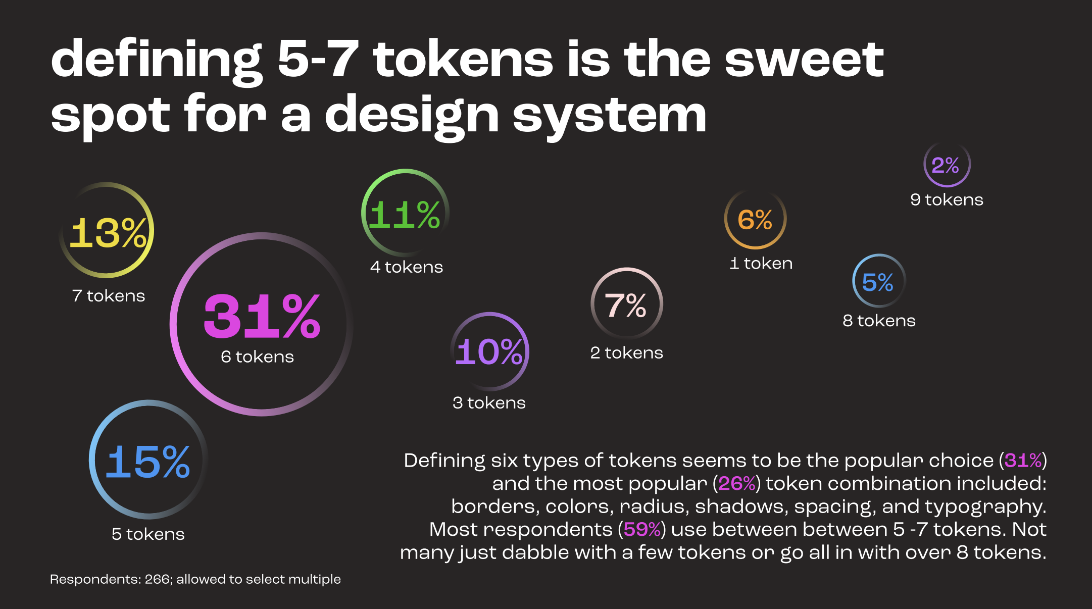
31% of respondents define 6 types of tokens, the most popular being colors, border, radius, shadows, spacing, and typography.
However, some larger design systems have to account for a lot, like multiple channels, themes, or modes. I find it helpful to learn about how other teams tackle their own naming needs.
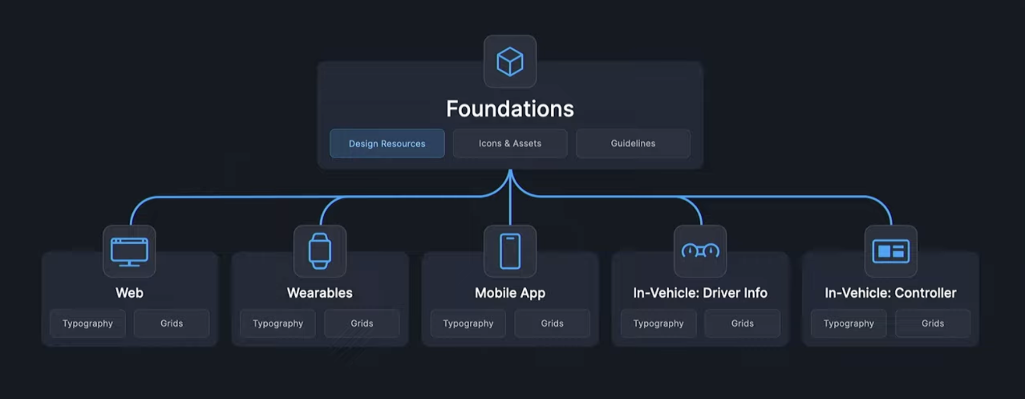
Here’s how the team at how the Ford Motor Company handles naming in their design system.
They have a massive design system with variables for foundations, typography, components, grids, icons, and assets. These variables are used across web, wearables, mobile apps, in-vehicle dashboards, and in-vehicle controls. They tackle naming by using different schemes relevant for each type of element.
For example, their naming scheme for typography variables is rather simple:
Category / Size / Usage
To put an extra large primary title text element in your design, you would use the following size variable:
Title/xLarge/Primary
That’s easy to understand.
Color introduce more complexity. The core color variables have a simple naming scheme:
Color / Value / Alpha
Which results in something like:
Blue/362/100A
But those variables aren’t used directly in digital products. The team creates foundational color variables that alias those core color values. (See my design tokens 101 post to learn more about aliases.)
The foundational color variables have 5 semantic naming levels:
Application / Behavior / Category / Placement / Emphasis Level
Each level answers a specific question:
- Application - What type of element is this color being applied to?
- Behavior - Does the color invert between dark and light themes or stay persistent?
- Category - What type of color is it? What information is it meaning to convey?
- Placement - Does the element sit directly on the surface, or on a different kind of background fill?
- Emphasis level - What level of emphasis does this element have?
For text elements with extra high visibility against a standard background, you’d use this color variable:
Text/Invertible/Neutral/OnSurface/xHigh
And for strokes on elements that communicate a critical status, you’d use this color variable:
Stroke/Invertible/Status/Critical/High
…
Keep in mind… this is a naming structure that worked for that org. Yours might look simpler or more comprehensive, depending the needs and conventions of your own team.
The important thing is to create something everyone at your org understands, document/publicize it well, and use it consistently.
—
Cheers,

Up Next: 5 Reasons Design Systems Fail
Design Systems Daily
Sign up to get daily bite-sized insights in your inbox about design systems, product design, and team-building:
New to design systems?
Start with my free 30-day email course →