Let's talk Storybook…
There’s a common tool used in the digital product development process that I think deserves a deeper dive: Storybook.
⚠️ — A few things you should know up front:
- Storybook is primarily an engineering tool, but it’s for showcasing live components and can include documentation, so I think it’s worth designers understanding better.
- Storybook is a tool for documenting web component libraries, but it’s isn’t really built to handle iOS or Android components.
Storybook is a component explorer that lives within your web application repository. It’s a tool for documenting and showcasing live prototypes of all of the components in your digital product’s component library. You can also create standalone pages with instructions, guidelines, and whatever other documentation you’d like to live alongside your components.
Where Storybook Fits
Let’s look at an example of where Storybook would fit within a React application:
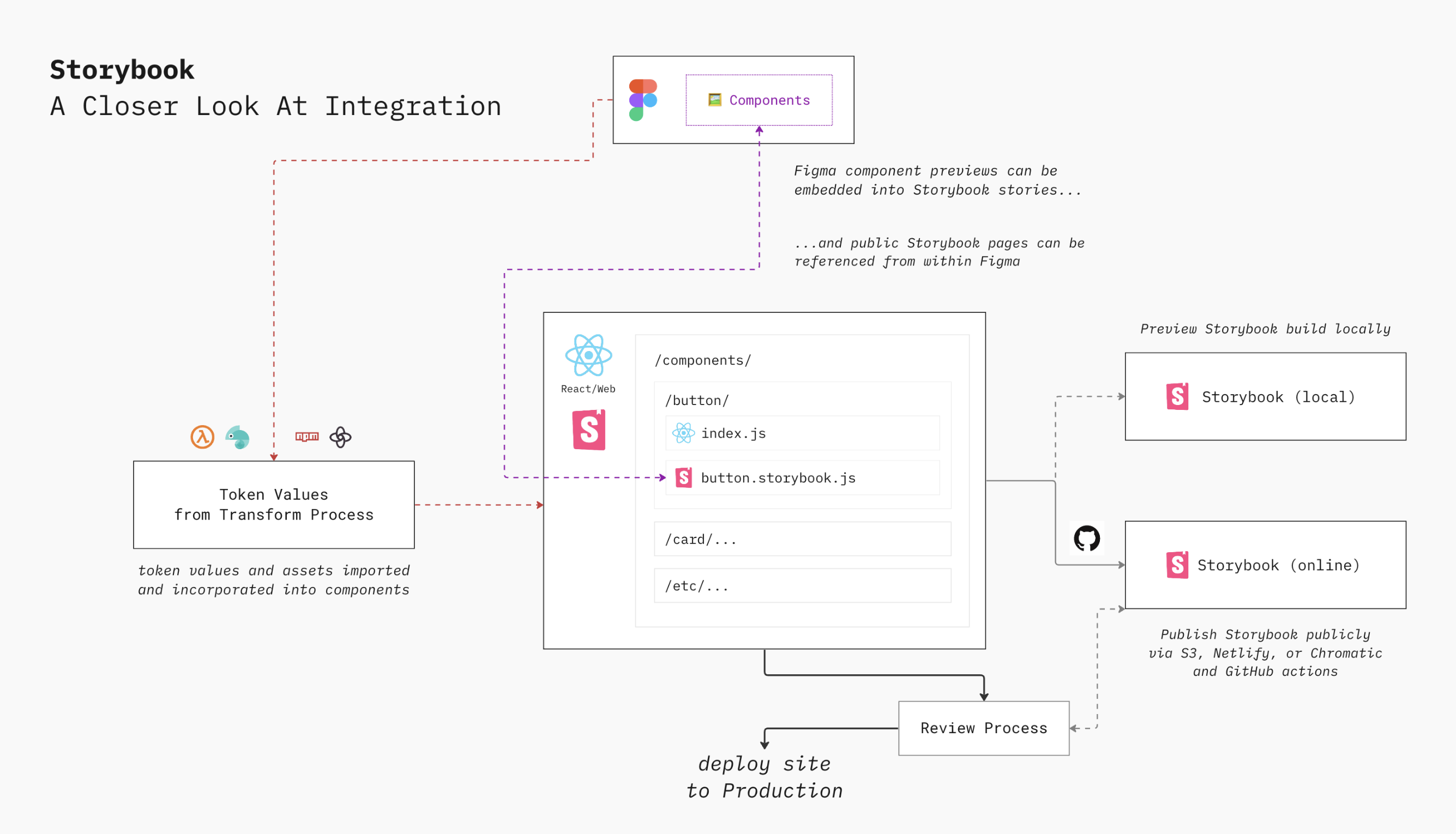
- Components, including styles, variations, etc, are created by design and product teams in a design tool like Figma, ideally using components that match software components.
- Key design decisions, like colors, spacing, sizing, etc, are stored as tokens and passed through some token transformation process, either directly to the web application codebase or a shared
npmlibrary. This is usually assets (icons, logos, etc.) and global and component-specific CSS variables. (This step is sometimes done via manual updates.) - Web-specific components are defined within a specific folder, created with the same properties, arguments, and naming conventions as their Figma counterparts, using the appropriate CSS variables (and by extension, design tokens) to style them.
- A Storybook story for each component is created, describing all of the interesting states supported by a component — these should match the variants in Figma. A reference to a specific component’s Figma frame can be included within that component’s story. This makes it easy to compare the designers intention with the actual interactive component.
- Components are reviewed within the Storybook component explorer, which can be run locally or published publicly, and this review can be incorporated into existing release/deploy processes.
- Once reviewed and approved, the application codebase is deployed to production.
The Setup
There are two key parts to setting up Storybook: stories and documentation.
Storytelling
When an engineer creates components in the application’s component library, they’d also need to create a story file in the same folder. For example, if /button/index.jsx defined a button component, they would create a /button/button.storybook.jsx file.
In its simplest form, the story is a script that imports the component’s code and exports it with a title. Storybook picks this up as part of a build process, and renders them out in a component explorer format.
But Storybook is most useful when you enhance your stories: add documentation, define variants or “interesting states,” display tokens in use, connect corresponding Figma component frames, set up visual regression and accessibility tests, and showcase interactivity. It can be a very useful place to provide design and UX guidance to engineers who are doing the building.
There are so many ways Storybook can be extended. Check out the Storybook documentation site for more.
Documenting
Another important part of setting up Storybook is good documentation. Similar to Javadoc or PHPDoc, Storybook’s Documentation module will take well-formed comments in your codebase and automatically render it out as documentation in the Storybook explorer.
This documentation can be defined within story files or as standalone files, using an enhanced version of Markdown (called MDX) that makes it easier to manage and maintain long-form documentation.
Sharing / Publishing
By default, Storybook lives in the repository where your components are defined. Engineers can spin up a local instance of the Storybook explorer, which is helpful for a quick check of components behavior, separate from the context of the application. This makes it easy to review all components, including their documentation, states, and relevant imported tokens.
An even better route, though, is deploying Storybook as a static web application to a public or internal facing site. That way, non-engineering stakeholders (design, product, QA, etc) can more easily review and sign-off on specific component updates without needing a local dev environment. You can either deploy this within your own infrastructure, or you can use Chromatic , a service run by the creators of Storybook for publicly deploying Storybook instances (with a generous free tier.)
If you do deploy Storybook to a public site, there’s a useful Figma plugin called Storybook Connect that lets you embed a component’s interactive story as a document frame within Figma, enabling designers to see embedded views of live components along side their visual component counterparts.
You can also embed published Storybook stories into Supernova , which can serve as a useful "third space" because it can pull in both design and code assets.
…
Remember, our goal here is to keep design and web engineering efforts in alignment. Storybook might not work for every situation, but it’s a powerful and extensible tool, especially for building out web-based digital products.
— Cheers, Jesse
P.S. Can you believe there are only 6 days left in the series? Thanks for sticking with it. I’ve gotten a lot of good questions and feedback along the way. I hope you’ve found it helpful!
—
Cheers,

Up Next: Organizing your team…
Design Systems Daily
Sign up to get daily bite-sized insights in your inbox about design systems, product design, and team-building:
New to design systems?
Start with my free 30-day email course →