Multi-platform design systems…
I’ve been talking a lot about how a good design system makes it easy to translate design decisions across platforms. But I haven’t spent a lot of time on how design systems work for native application development like Android, iOS, Kindle, etc.
Here be dragons.
Let me start by saying: it’s impossible to share components between web and native applications.
There are tools like React Native that let you use your React web components to develop apps for mobile platforms, but it come with a performance hit and isn’t feasible for all applications. Google’s Material design system has iOS components, but they’re not the same as the Javascript-based components. They’re written in Swift/Objective-C and are being phased out in support of Apple’s Human Interface Guidelines.
On top of that, there’s an important philosophical question with practical consequence: how much should the interface of an application look like the ecosystem of the device it’s on vs. adopting brand-specific UI patterns? You’ve got a lot of creative control over your interface on the web; but more and more, device ecosystems are encouraging (sometimes even requiring) applications to adopt device-specific interface guidelines.
That leaves design system teams with an important question: How do we design for native applications? What are the most useful design-related tools and information that we can provide to the teams that build those out?
…
Let’s borrow some lessons from a similar challenge the digital industry faced about a decade ago: responsive web design.
There’s a design challenges that exist when you’re trying to translate a single user interface across multiple viewport sizes. People would design complex interactions on 1200 pixels wide screenshots, but what does that interaction look like at 300 pixels? What about 150 pixels?
The solution came down to identifying core interactions, building those out at the smallest feasible screen size, then progressively enhancing the interface as a user’s device size allowed.
Someone designing for multiple viewports would consider the following questions:
- What are the core interactions our users need?
- How do we get all that functionality into a small viewport?
- Is there a width at which we eliminate some functionality?
- How do we enhance at larger screen sizes without making mobile feel like a second-class experience?
…
You need to ask similar questions when you think about how supporting multiple non-web platforms with your design system. What are the “core design elements” of your brand? How much of that can you realistically pull into a native application? What’s the best way to get that information into your native apps? What’s the best way to reflect that in your visual prototyping?
You may have a robust Angular component library, but that’s not a useful resource for your Android team. You could let the two teams manage completely separate component libraries—they are different codebases after all. But what if you created a resource that could benefit both?
Imagine a token library with your brand’s foundational design decisions that could be imported and integration into both component libraries as a sort of global design configuration file (and ideally your visual prototyping tool). That way, if you need to make a change to some of those fundamentals, the overall design is being driven by the same configuration file.
Here’s a few specific examples of what this might look like. I’m Supernova’s robust export functionality using a tokens file that I imported, but you could also create a transform/export process with Style Dictionary:
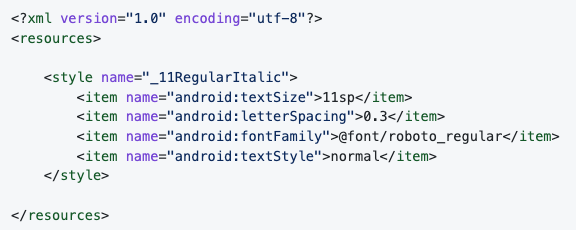
Properties that get exported for Android are color definitions, text styles, fonts, radii, measurements. Here’s a sample of the export format for Android:
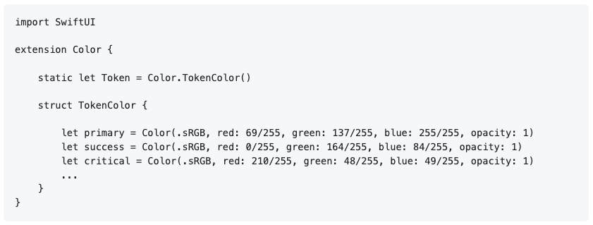
Properties that get exported for iOS (SwifttUI) are color definitions, text styles, gradients, shadows, borders, radii, measurements. Here’s a sample of the export format:
Remember, the goal here is to make consistency easy. It’s not fool-proof. Those values still need to be integrated and translated following the considerations I mentioned earlier. But it makes it more likely that developers will err on the side of consistency, it reduces their need to hunt around for those choices, and it improves your company’s ability to manage design at scale.
A few other important considerations:
- Design components are not what will end up in your application. Your engineers need code counterparts for the various platforms in their respective codebases.
- Because of this, developers will need access so they can review the designs, get a sense of how design tokens should be used and components structured, and grasp the designer’s intent overall. Nothing replaces good inter-team communication, but tools, documentation, and guides can be very helpful.
- Engineers will also need a way to pull design token values in to the relevant application codebases. Tokens will require some amount of transformation to make them useable within your applications. Tools like Style Dictionary and Supernova can help with that transformation pipeline. If token transformation is something you’re interested in, let me know, and I can write more in-depth about that.
- The more your engineers can standardize the way that components are structured and styled across various platforms, the more useful your design system will be long term. Keeping naming convention and component properties similar across your codebases — web, native, etc — and in sync with your design files is key.
—
Cheers,

Up Next: Pre-built vs. roll your own…
Design Systems Daily
Sign up to get daily bite-sized insights in your inbox about design systems, product design, and team-building:
New to design systems?
Start with my free 30-day email course →