Day 16: Someone else’s component in my app!
Yesterday was difficult, but today that work pays off, because I can finally pull the Atlassian design system into my app.
Since all of the version requirements are set up, I can go on to the next command: yarn add @atlaskit/css-reset @atlaskit/tokens. I ran this from the command line inside my application’s folder, and several things happened:
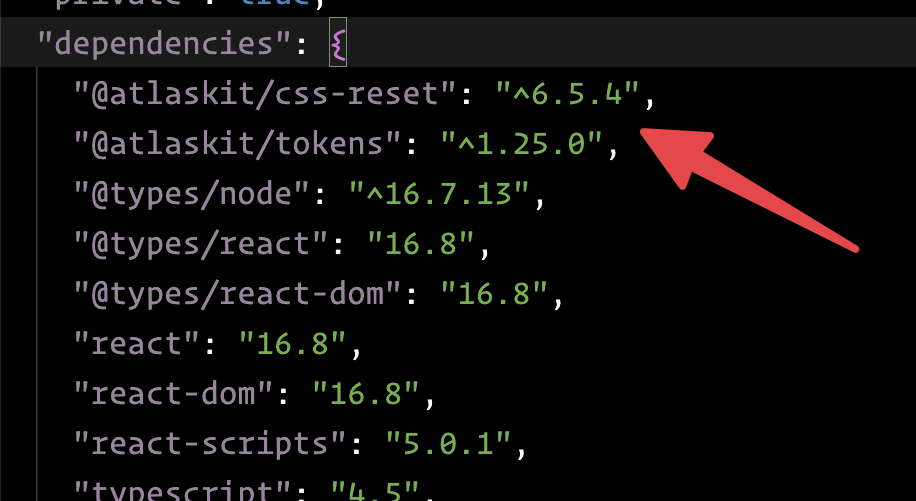
Remember package.json, the file that lists out all of an app’s dependencies?
New dependencies showed up under the dependencies list — @atlastkit/css-reset and @atlastkit/css-tokens. That means wherever the app gets installed, it will also pull in the design system code into our codebase (it gets saved in the node_modules folder.)
Now that that works, I need to follow the next step:
import '@atlaskit/css-reset';
No instructions as to where to drop this, but the documentation said it should go in the root of my application. I’ve done this before, so I know I need to put this at the top of my index.tsx file.
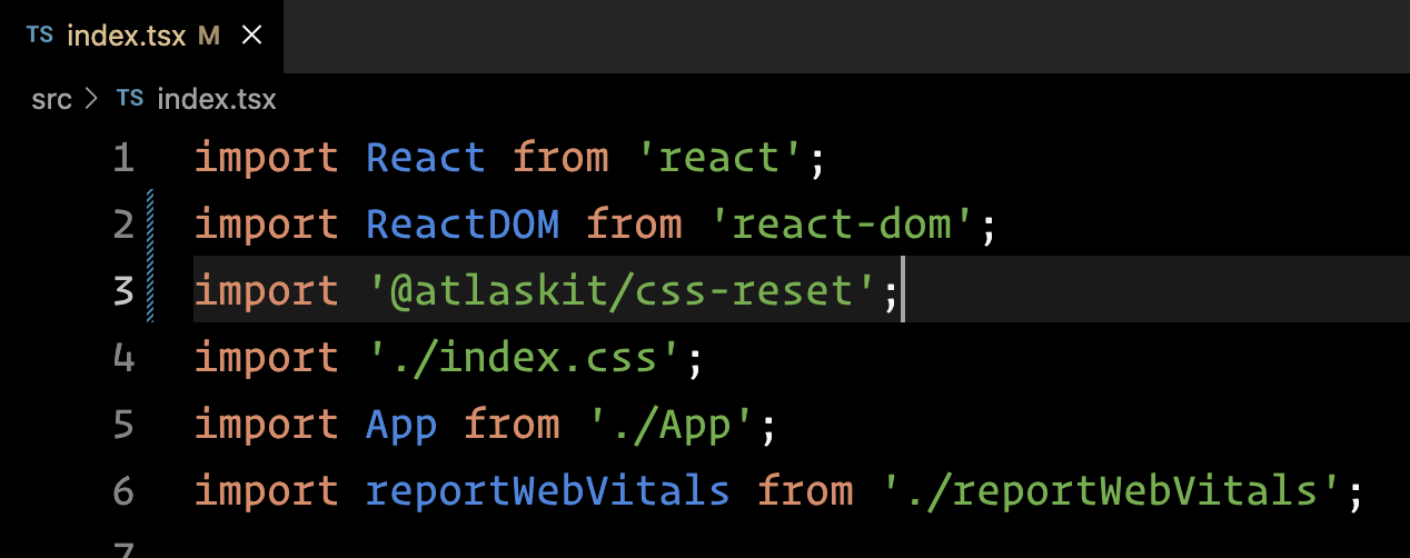
When I run yarn build (the command I use to start my app), everything runs as expected — no errors. I just need to pull in a component and display it in my app to test that everything works, end-to-end.
The documentation anticipates this and tells me to run yarn add @atlaskit/button in order to add the button component as a dependency to my project. That runs, no problem.
However, here are the instructions for adding a button to my app:

As before, there are no real instructions for including this into my app.
I know from experience that I need to include the import line to the top of my App.tsx file, since that’s where I’ll be using the button. But I had to modify the usage instructions significantly, since the create-react-app used the traditional functional declaration for rendering the app, but the Atlassian instructions used the newer arrow function syntax. (I also added appearance="primary" to the button… more on that tomorrow.)
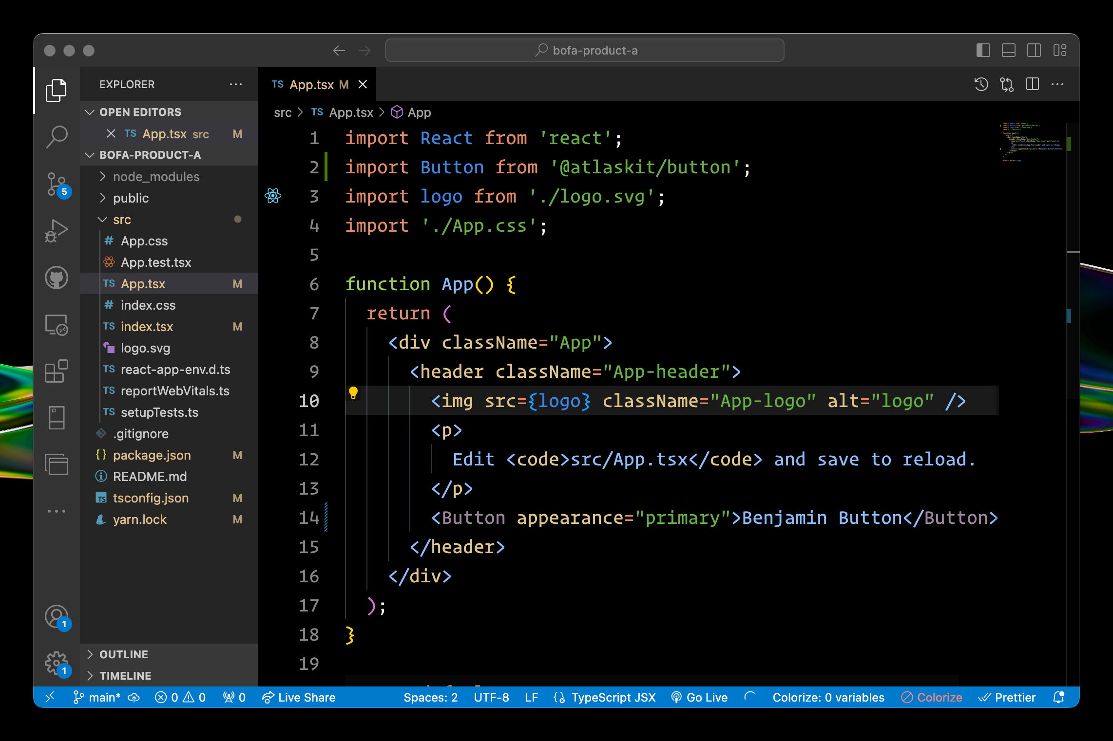
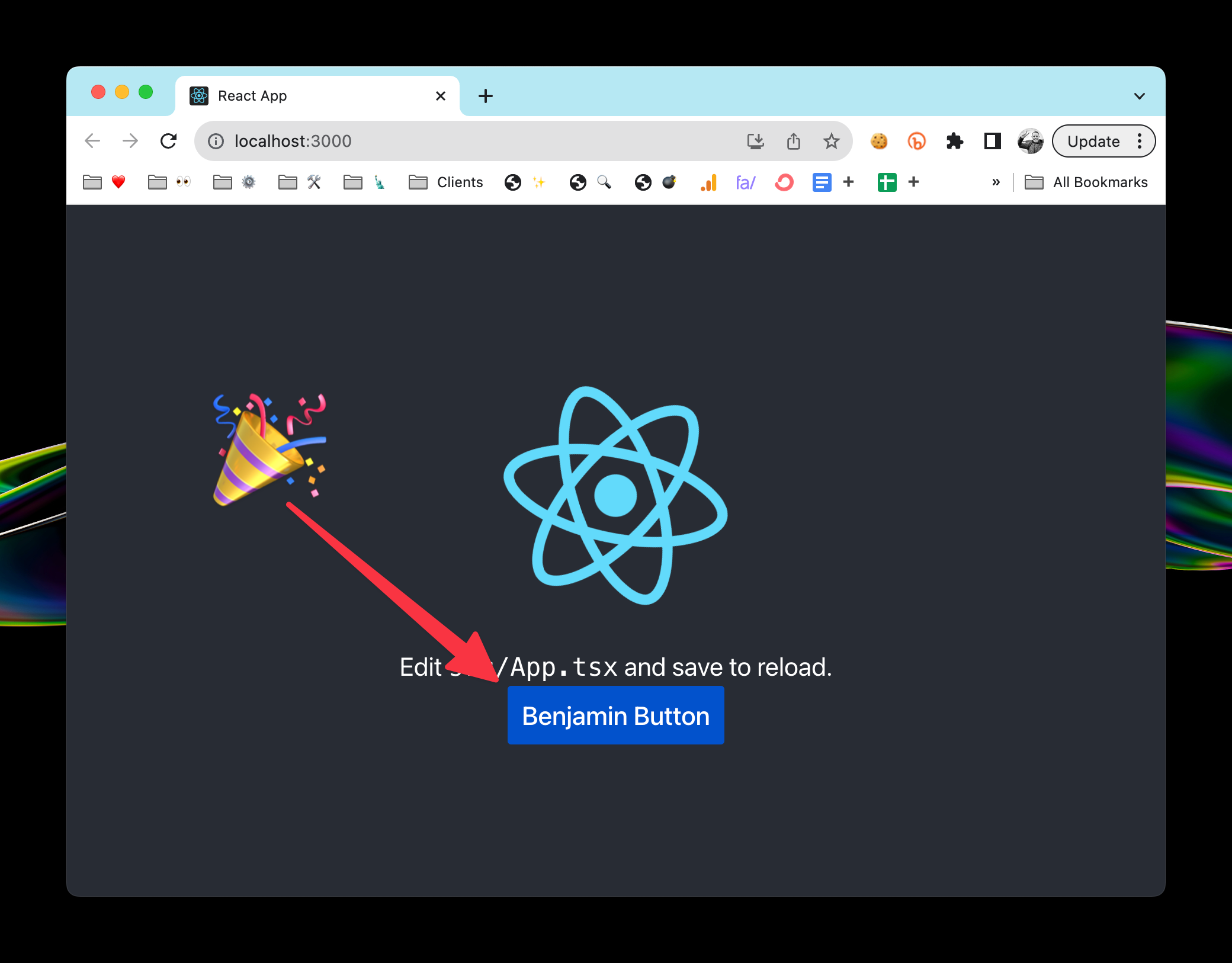
With those changes in place, it’s finally working. I’ve pulled in the Atlassian design system and placed one of the component in my app.
…
Whew!
Hopefully you stuck with me on this and learned a bit about the kind of challenges app developers wrestle with.
Also, I hope you’ve gotten a good example of this lesson: figure out what assumptions you can make about your audience’s skill level. If your target audience is likely not to know how to do a thing, be sure to explain that in the documentation. If you think your target audience is likely to understand something, make sure you verify that assumption.
The design system is included in my app. I’ll spend one more day pulling in some extra components and building with them.
—
P.S. If you’ve just joined the list, I’m in the middle of a practical design system build. You can catch up at the beginning of the series here.
—
Cheers,
Design Systems Daily
Sign up to get daily bite-sized insights in your inbox about design systems, product design, and team-building:
New to design systems?
Start with my free 30-day email course →