Day 2: Looking for common patterns
I kicked off a hypothetical design system project yesterday. I captured screenshots of some Bank of America digital products in Figma so I could compare them side-by-side and look for common patterns.
What I’m looking for are common design patterns; that’s what design systems are meant to solve for. I’m using Dan Mall’s rule of three — if a pattern shows up three or more times across existing products, it’s probably a good candidate for being turned into a shared component.
Once I’ve identified a common pattern like this, I’ll create a new page for it in Figma and start dropping representative screen grabs from each digital product. I’m not going to get hung up over names at this point. If everyone agrees on a name, stick with it, even if its non-standard. The more you lean on existing conventions, the easier it is to get buy-in.
For example, I found this pattern at the top of several of the BofA sites:
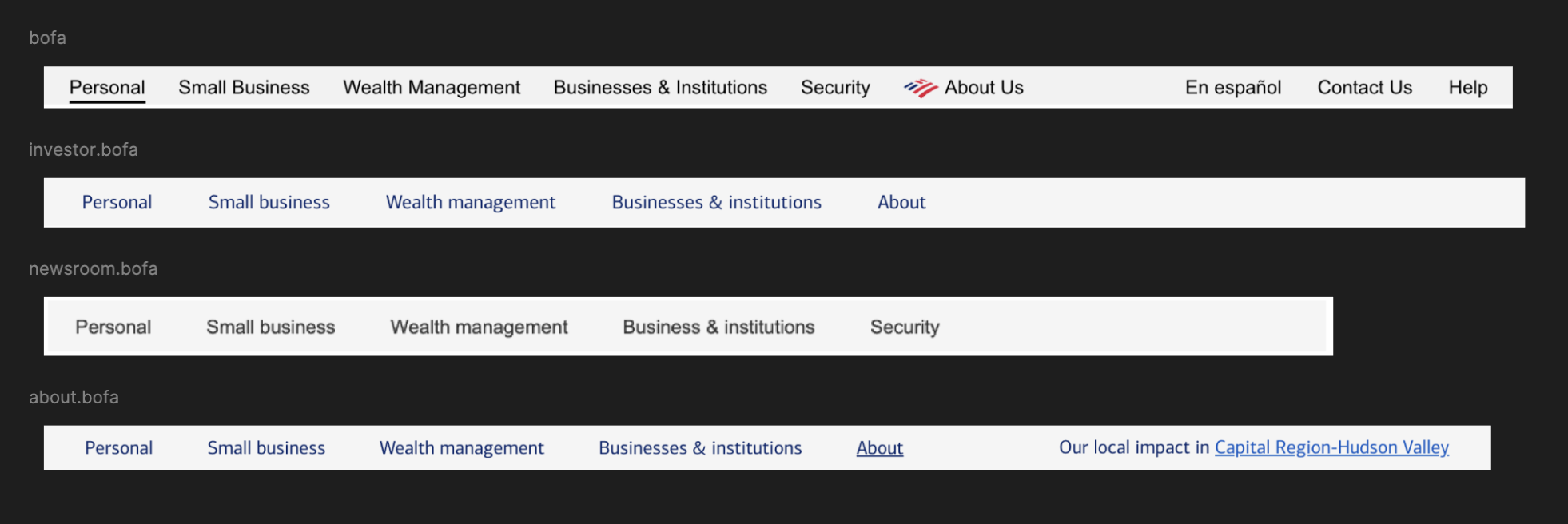
I’m inclined to call this a “service bar,” since it links to other services and products in the company’s portfolio. But several sites labeled this a “utility nav” in the source code, so I’ll use that for now and make a note to discuss this with the team later.
If there isn’t a clear consensus, Storybook has a glossary of component names which can be a helpful starting point for teams.
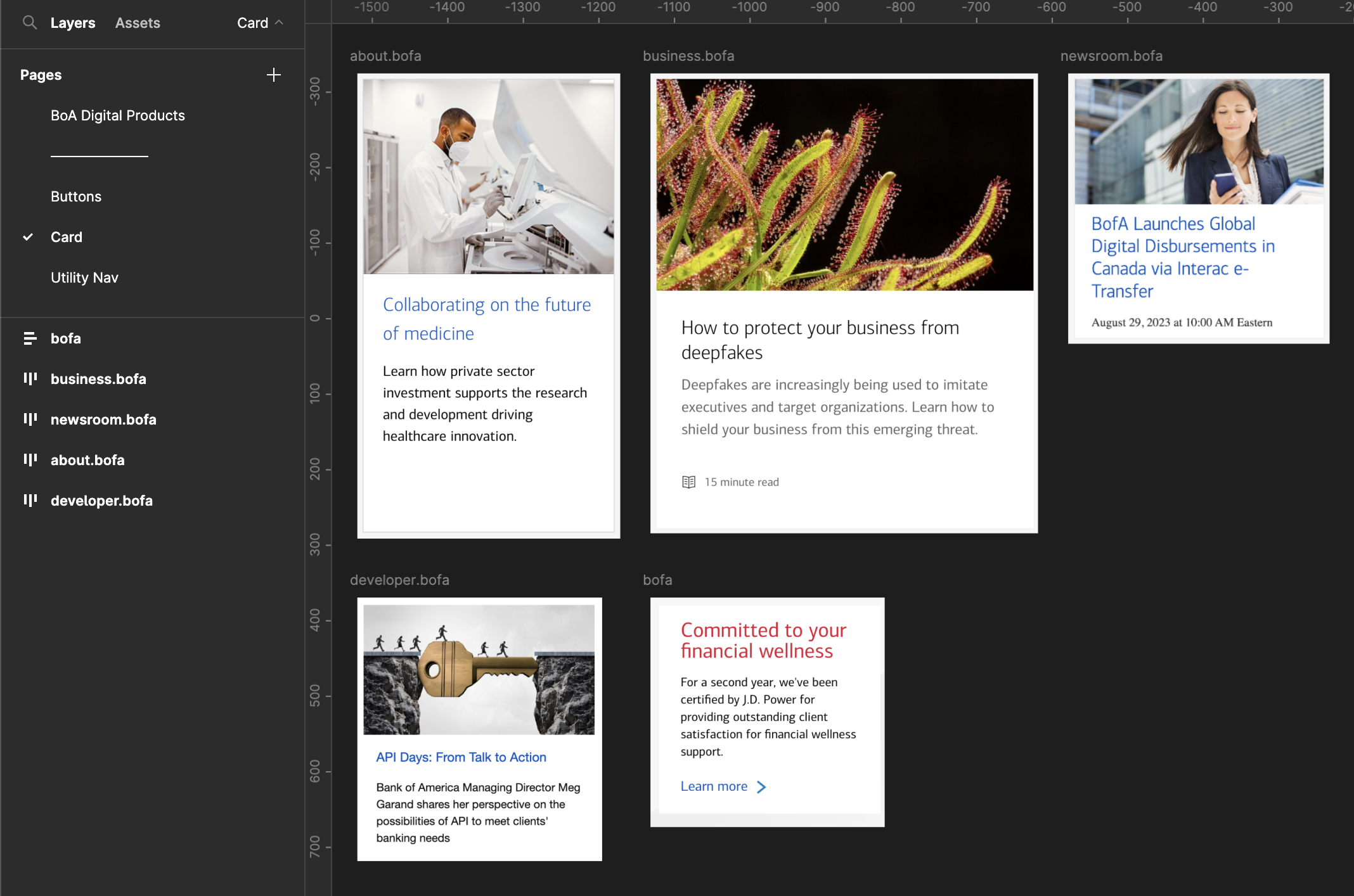
I noticed that several of the sites have some variant of a card component, so I created a new page, labeled it “Card,” and started dropping snaps of each card component across products. I labeled each snap with a shortened version of the domain its from in case I needed to reference it on site.
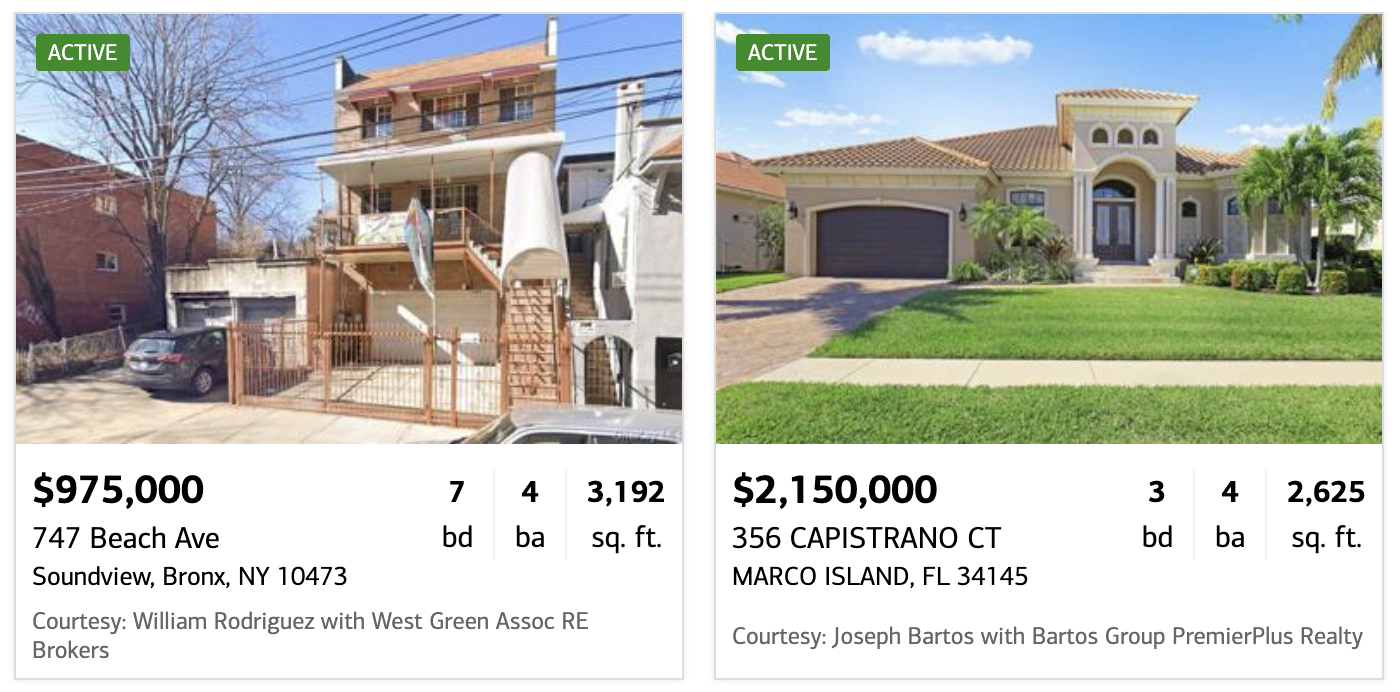
There were a few components that looked like they might be considered cards, but they were non-standard enough that I decided not to include them. For example, these real estate listing cards have a lot of custom metadata and unique layout properties:
These promotional cards have icons, unusual positioning, and the entire lock-up has a custom sloping shape, so I decided to leave them out as well:

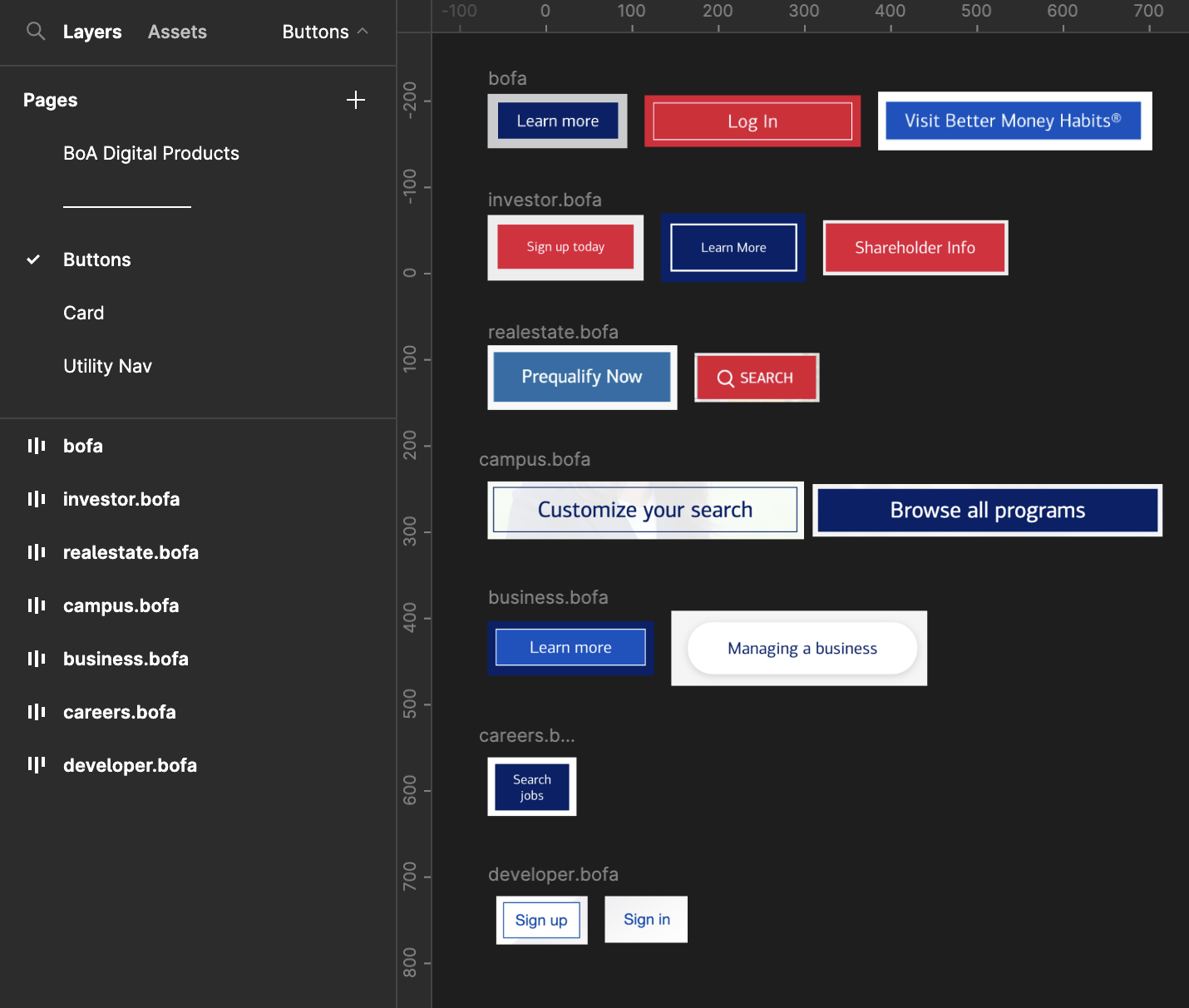
I created a page for buttons. There’s considerable consistency already for buttons across products.
Which brings me to another key point: when possible, prioritize patterns that are unique to your org but still used often across digital products. It’s easy enough for teams to grab a card or button component from a library like Tailwind or Bootstrap.
When you build a component that standardizes a critical pattern unique to your org, though, you give teams a compelling reason to adopt your design system. This is an important and under-appreciated first step.
With that in mind, I think the utility nav might be a good first component. It’s high-visibility at the top of the page, so it has considerable impact on the perception of brand consistency. I also know from experience that components like this are often the target of org-wide updates (e.g. when a new service launches or is acquired), so standardizing seems like a win on multiple fronts.
Tomorrow, I’ll go through the process of extracting patterns from multiple instances.
—
P.S. If you’ve just joined the list, I’m in the middle of a practical design system build. You can catch up at the beginning of the series here.
—
Cheers,

Up Next: Day 3: Extracting patterns with a commonality spectrum
Design Systems Daily
Sign up to get daily bite-sized insights in your inbox about design systems, product design, and team-building:
New to design systems?
Start with my free 30-day email course →