Day 3: Extracting patterns with a commonality spectrum
I’m building out a design system pilot, and yesterday I began identifying and collecting common patterns across multiple BofA products.
Now, I’m going to attempt to extract a unified standard from those various patterns.
I’ll start by ranking a pattern’s design characteristics on something I call a Commonality Spectrum. I draw a line on a given pattern’s page and label it “More Common” on one side and “Less Common” on the other, like so:

If I see the same color used in a lot of patterns, it goes closer to the "Common" end. If a color shows up in just one or two patterns, it goes towards the "Uncommon" end.
Here’s the spectrum for the utility nav pattern from yesterday:
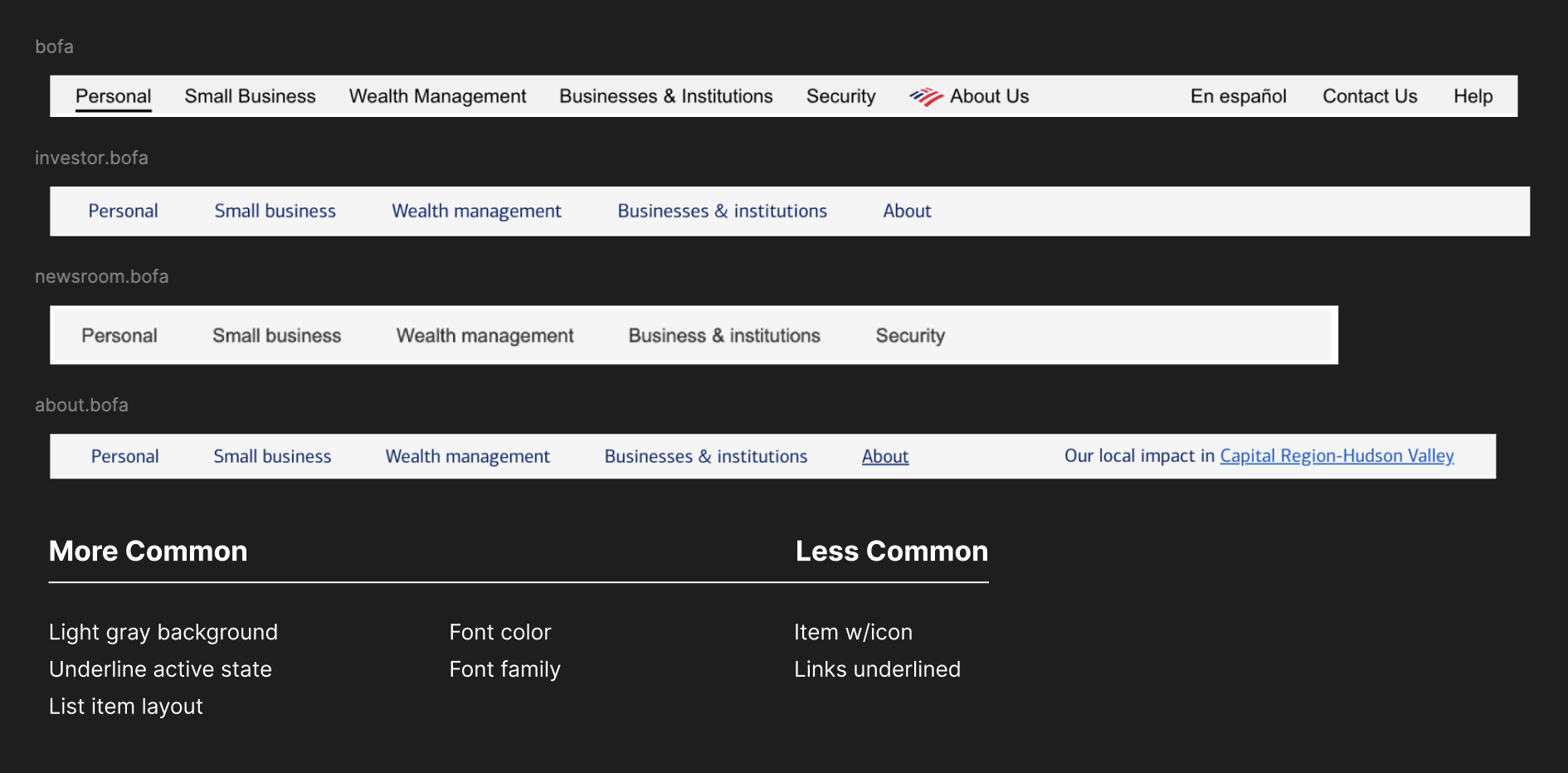
Everywhere this pattern shows up, the background color and layout are all fairly similar. The underlined active state seems common, though it looks misleading because it isn’t the active site some places its used. (That might be a worthwhile question to raise with teams about its usefulness/functionality.)
Less common characteristics: the font color on half of them is black and the other half is blue. The font family on half of them is Arial, while the other half is Connections, Bank of America’s official font. It’s probably a safe bet to use the official BofA font, but the preferred color may not be as obvious.
Even less common are outliers like the inline logo icon or the underlined links in that right aligned link (is that a link or the active state?)
The utility nav is a boring example, because the instances are all so similar. Here’s the Commonality Spectrum for the card component, which has a bit more going on:
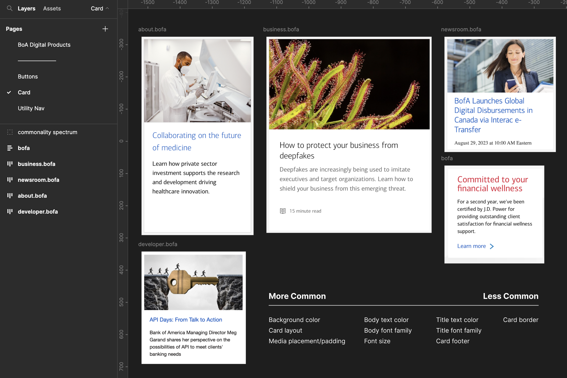
Some common elements are the background color, card layout, media placement, and body text. Less common elements are the card footer, title text, and card border.
The rule of thumb here is that the more common a characteristic is, the easier it is to turn it into a standard and convince teams to adopt it. The less common a characteristic is, the more I’ll either need to convince someone to go without it or offer it as a variant.
I’m trying to be mindful here that my next step will be creating a component I can pitch to the team. If this looks like a close relative to what they’ve already got or like a killer pattern another team has that they want to get into their product, it will be an easy conversation.
I’m not trying to be novel here. I’m trying to find the common design decisions and codify them into an intentional standard. The more I start taking creative liberties, the more convincing I’ll have to do. It can also send the harmful message that I don’t think they can’t be trusted with design decisions, which is absolutely not the tone I want to strike when I’m trying to encourage collaboration and build consensus.
Okay, I’ve got a lot of good information gathered about what characteristics my first component should have. I’ll start building it out on Monday based on what I’ve learned through this process.
Enjoy your weekend!
—
P.S. If you’ve just joined the list, I’m in the middle of a practical design system build. You can catch up at the beginning of the series here.
—
Cheers,

Up Next: Day 4: Building a component
Design Systems Daily
Sign up to get daily bite-sized insights in your inbox about design systems, product design, and team-building:
New to design systems?
Start with my free 30-day email course →