Day 4: Building a component
In the last email, I ranked design choices across patterns to help me extract a design for my first component. Now I’m ready to start building in Figma.
My first component is the utility nav, which is an ideal use case for auto-layout. If you know your way around Figma, this may be old hat. But auto-layout can be intimidating for beginners and easy to overuse, so I’ll take it slow and explain the details.
You might think I would draw a light gray rectangle, place some text over it, and group these. But auto-layout works more like a web element, and when it’s used well, it can make your components much more flexible and useful in different contexts (this will become a recurring theme for better integration with software). More on that in a moment.
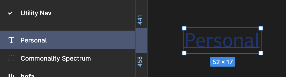
I’ll start by placing a text field (T) on my Utility Nav page and typing the first word in the Utility Nav menu. I’m using PF Centro Sans Pro, which is fairly close to BofA’s proprietary font. The color split was 50% black, and 50% blue, so I chose blue to distinguish it from the main nav. It’s hard to read right now, so let’s address that.
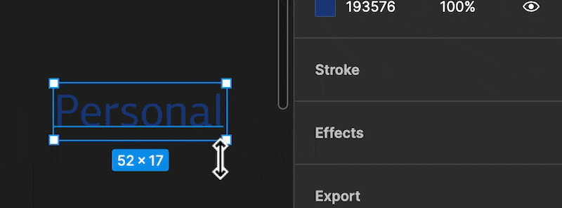
To convert a layer to auto-layout, I select it with the Move tool (V), then press Shift-A. Several important things happen. I get a display that looks more like a browser element inspector, with padding and internal handles inside each edge of the container.
But you’ll notice that the fill for the text was blue; but when I changed it to auto-layout, the fill went blank. That’s because the text layer is now sitting inside an auto-layout frame with no fill. I’ll set the fill to light gray.
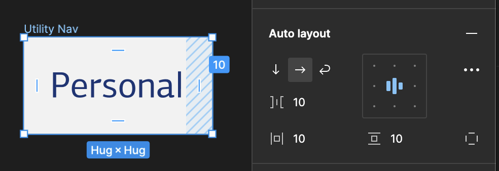
Auto-layout can be confusing because you’re setting the rules for how items flow in a given frame versus traditional drag/drop placement. Here’s a quick explanation of the auto-layout panel that appears when you have an auto-layout layer selected:
- The top left option with arrows defines if additional objects added to that layer should flow vertically, horizontally, or wrap to fill the frame. My utility nav will be set to horizontal.
- Beneath that, the bracket with the line in the middle, sets the gap between items.
- Beneath that, the square with the lines on the left/right and top/bottom — these set left/right and top/bottom padding. Clicking the dashed square on the bottom right will present options to set left, top, right, bottom padding individually.
- The box in the top right sets the overall alignment of items in the auto-layout frame. (Important when resizing!)
- You’ll also notice “Hug x Hug” beneath the frame and on the frame settings panel. From that panel, I’m able to tell the frame to shrink snug to the items inside or to hold whatever size I’ve manually drag/dropped it to.
…
I added another text layer inside the frame, and notice what happened:

Now, when I select the frame and hover between the items, I get a pink highlight. This is the gap setting. I can drag that from there or set it in the auto-layout panel. I used an 8px-unit scale and set the padding on the top/bottom to 8px, padding on the left/right to 24px, and the gap between items to 36px.
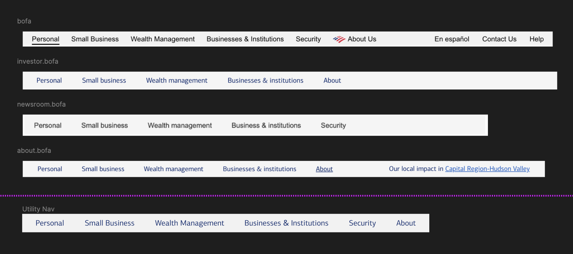
In case you missed it, my component is on the bottom beneath the purple line. It doesn’t look much different from the other patterns I snipped from the digital products… and that’s a good thing. You’re standardizing, not inventing.
Tomorrow, I’ll put the finishing touches on this and talk about a few outstanding issues and important considerations I haven’t addressed yet.
—
P.S. If you’ve just joined the list, I’m in the middle of a practical design system build. You can catch up at the beginning of the series here.
—
Cheers,

Design Systems Daily
Sign up to get daily bite-sized insights in your inbox about design systems, product design, and team-building:
New to design systems?
Start with my free 30-day email course →