Day 5: What to expect when building components
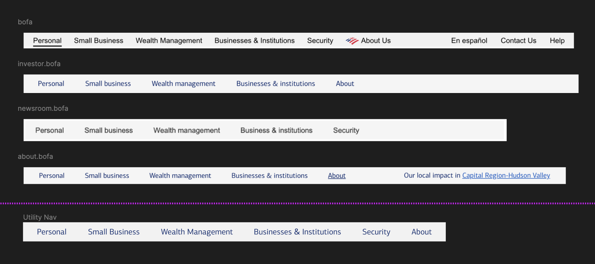
I built my first component in Figma yesterday — a utility nav for Bank of America, but there are three important things I didn’t mention.

Let’s start with the obvious one: my component doesn’t show the active state (underline). If I shared this with a developer right now, how would they know I expect active nav items to be underlined?
My expectations for behavior aren’t clearly expressed. What logic determines active state for a nav item? Should the underline also appear when I hover over or tab to a nav item? I should document expected behavior directly on this component page (especially if it doesn’t exist anywhere else).
Secondly, I didn’t address the extra text in the right hand side of the bar — it’s just gone. One product has additional nav items in the right sidebar. Another product seems to be inserting some location-base call-to-action.
Since I’m looking to create a standard interface, I’m going to suggest we keep those items out altogether or add them to all products. But this is a conversation I would need to have with engineering since it’s different than what they have.
Finally, I’ve noticed that every place this component appears on the web, it’s hidden at mobile viewport sizes. In other words, this component is only useful for larger viewport sizes.
That makes it easier to design in Figma, since the layout doesn’t need to be responsive… but it also means this is probably a less valuable component. That may be fine. Boring is often good in design system work, and a low-impact component can be a low-risk way to pilot the design-to-dev workflow. But it might be harder to argue that we are tackling meaningful work.
This might be another good conversation to have with engineering and stakeholders — is this utility nav important enough for me to create a collapsed mobile-version of the utility nav?
I plan to turn this frame into a proper Figma component so I can create variants and props. I’ll explain what that means, why its useful, and tackle it in depth tomorrow.
—
P.S. If you’ve just joined the list, I’m in the middle of a practical design system build. You can catch up at the beginning of the series here.
—
Cheers,

Up Next: Just another commodity…
Design Systems Daily
Sign up to get daily bite-sized insights in your inbox about design systems, product design, and team-building:
New to design systems?
Start with my free 30-day email course →