Day 6: Local, global, connected… oh my!
Back at the DS work today… but for all the work I’ve done, I haven’t actually created a proper component yet.
In a previous post, I mentioned that people can often mean many different things when they use the word component. For the sake of today’s email, I’m talking about a Figma component, which has some specific characteristics:
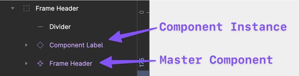
- It is a layer (or group of layers) that gets special treatment in Figma, like a purple ❖ diamond next to its name in the Layers panel or showing up in the Assets panel;
- It can be re-used as instances across multiple screens, and a change on master component will update all of the instances;
- It can contain props, which are the changeable parts of a component, defined as values that can be connected to specific design properties;
- It can have multiple variants, or different variations, of the same component with various style combinations, and they can also contain their own unique props.
- It can be published to a library for use in other projects;
- It can also be imported for use in FigJam (Figma’s whiteboarding tool).
So… there’s a lot of benefit behind creating components.
Variants and props are big enough topics to get their own post, so today I’m going to focus on simply creating a master component, placing some instances, and publishing.
…
When I last left my humble utility nav, it was an auto-layout frame with a background color and several nicely padded text layers.

To turn this into a component, I simply selected it and pressed CMD-OPT-K, though I could have right-clicked and selected “Create Component.”
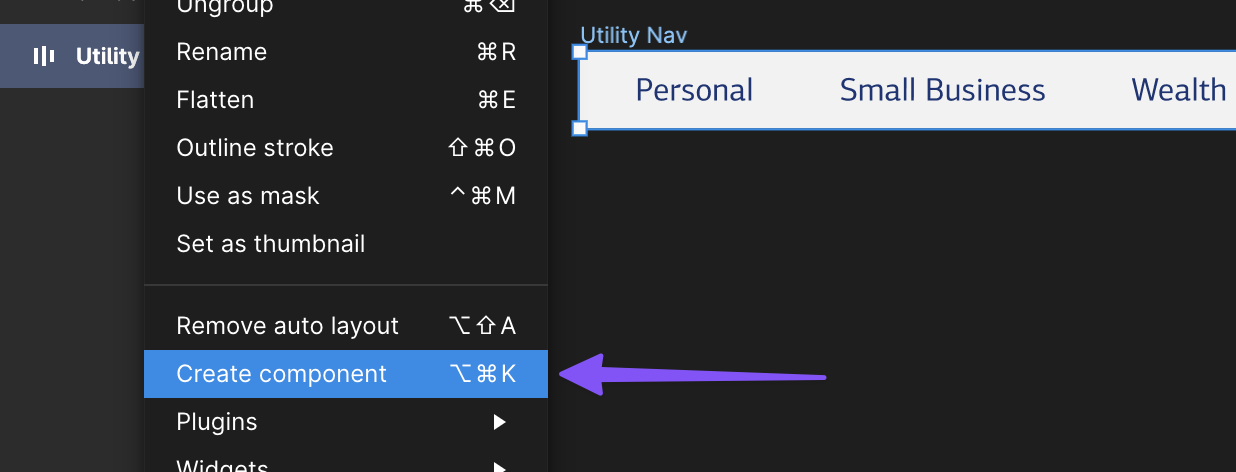
It now has the purple diamond — that’s how you know it’s a component!

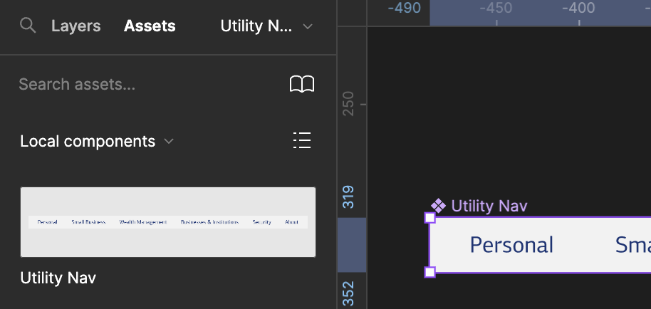
If I click on the “Assets” tab at the top of the left sidebar, I can now see my component.
Now I’m ready to place a couple of instances. I’m going to place them on my Digital Products page, right on top of my screenshots so I can see how my new standardized approach will look in context. This is me trying on a new shirt and looking at it in the mirror to make sure it works.
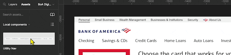
I drag it over the top of the existing utility nav on the BofA home page. I may need to cover up part of the screenshot utility nav with a gray box, but that’s trivial. I dragged my new component to each of the screenshots that have them to see how it looks.
The blue text is a light, so I’m going to go back to the master component and change the font to black. As soon as I do, every instance of the utility nav updates. I can see those changes real-time.
Now, I want to publish my component so that other teams could easily reuse it in another Figma project (fair warning: this requires a paid account).
With the Assets sidebar still open, I clicked the book icon in the upper-righthand side of that panel and selected Publish:
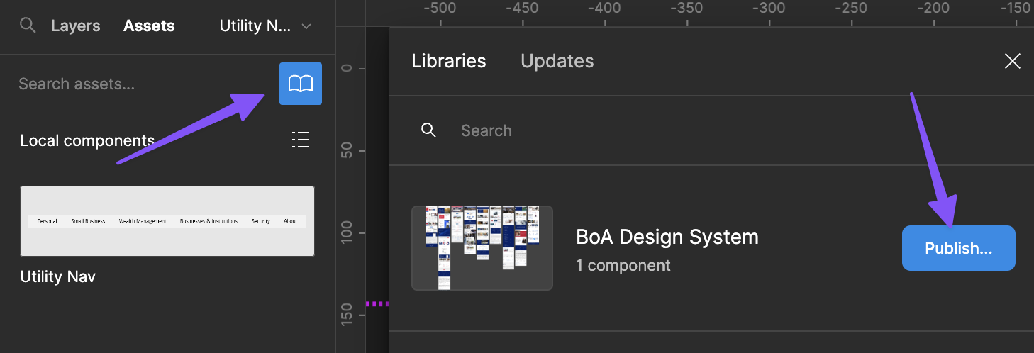
I just needed to write a commit message (this whole interaction is very GitHub like) to get the library published.
Now that the component is published, I can import it into another project and start building with it. There’s even some neat versioning features, which can be useful when you start releasing consistent updates.
—
P.S. If you’ve just joined the list, I’m in the middle of a practical design system build. You can catch up at the beginning of the series here.
—
Cheers,

Up Next: Day 7: Do I need variants and props?
Design Systems Daily
Sign up to get daily bite-sized insights in your inbox about design systems, product design, and team-building:
New to design systems?
Start with my free 30-day email course →