Day 8: Component-ception
Today, I’m creating a new component from the text layers in my Utility Nav component. Yep! Components can contain other components. A new component for nav items will let me create multiple states for each item and will give me additional flexibility later on.
I’ll start by duplicating one of the text layers from inside the Utility Nav, then pressing Cmd-Opt-K to create a new component with it. (I put it on a white rectangle to make it easier to see the dark text.)
There’s my new Nav Item component with a text layer inside!
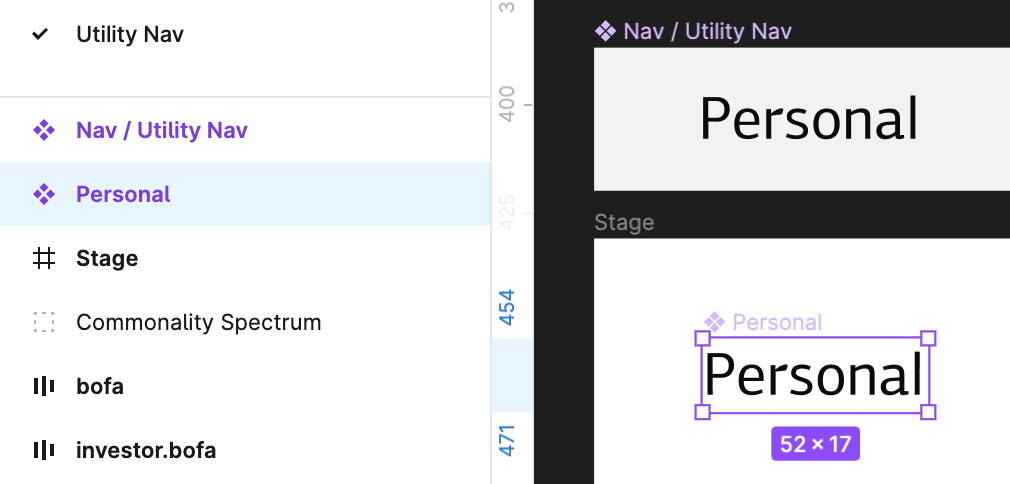
Whoops… my new component got named Personal since that was the text inside the layer when I created it. 🙃
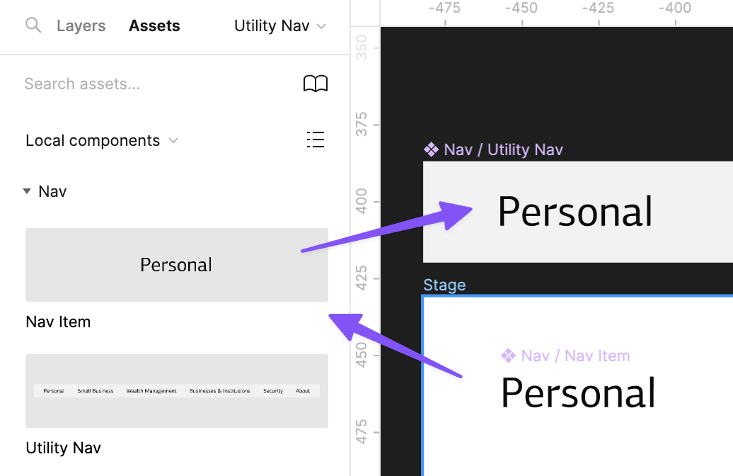
I’ll double-click the component in the sidebar and rename it to Nav Item. Better yet, I’ll name it Nav / Nav Item — that tells Figma to group it together with Nav / Utility Nav in the Assets panel.
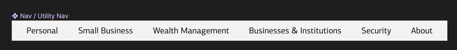
When I click on the Assets panel (top left), there they are! Now, I’ll drag an instance of the Nav Item out of the Assets panel into the Utility Nav.
Notice, it sits inline just like all the other text layers, but it’s got an outlined diamond shape — that means this is one instance of our Nav Item component. Notice the 4-square
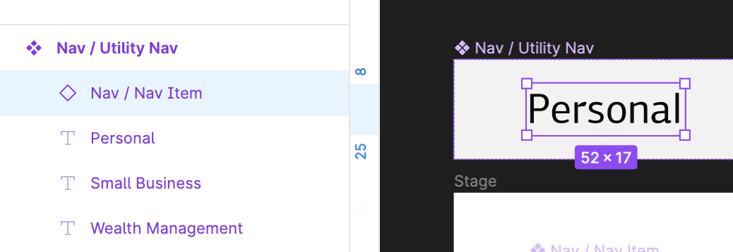
After I delete the rest of the text layers, I select the remaining Nav Item instance, and press Cmd-D five times to create 5 more instances. I double-click each one and type in the label.
⚠️ It’s worth mentioning here: by double-clicking and tying in new labels into each component instance, I’m creating a text override. A change to the master gets propagated to all instances, but the text won’t change. This seems like a minor point, but overrides are key to understanding how components work.
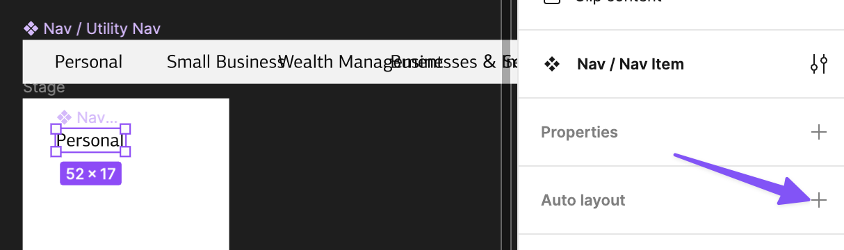
Well, now… I’ve run into a weird problem:

When I created the Nav Item component, its width was given a fixed size to match the text layer inside. Fortunately, Figma’s auto-layout has a vertical and horizontal “hug” option, which acts like shrink wrap, making the width/height of the element only as big as whatever is inside it.
Selecting the component and enabling auto-layout fixes this. The component now stretches appropriately based on the text inside.
There’s more to do, but I’ll stop here for today since this has already gotten quite long.
I know this might feel like we went the long way around to end up at the same place we started, but stick with me. This setup give me flexibility in the long run, and — more importantly — there are some useful lessons here that will come in handy for other types of components you might face.
Tomorrow, we prop!
—
P.S. If you’ve just joined the list, I’m in the middle of a practical design system build. You can catch up at the beginning of the series here.
—
Cheers,

Up Next: Day 9: Conveying state with variants
Design Systems Daily
Sign up to get daily bite-sized insights in your inbox about design systems, product design, and team-building:
New to design systems?
Start with my free 30-day email course →