Day 28: Chronicle a build journey
You know what’s so great about today’s post?
I don’t even really need to write it.
Seriously, I’ve already chronicled my journey of publishing this shared component and using it in multiple existing products.
Like I mentioned a few days ago, the hard part was creating the content. Now that it exists, I just need to move it to a more discoverable location: Storybook docs.
Storybook’s Documentation module lets you add pages to your components, documentation that lives in your codebase and gets rendered out as documentation in the Storybook explorer.
I can define some documentation within story files, which is good for small usage notes. But I can also create standalone files using an enhanced version of Markdown (MDX), which makes it much easier to write and update long-form pages. This is especially good for detailed information: usage guidelines, accessibility notes, common problems, implementation gotchas, change log, roadmap, etc.
…
Setting this up is fairly straightforward.
I created a new file alongside my component called UtilityNav.mdx and filled it with some documentation:
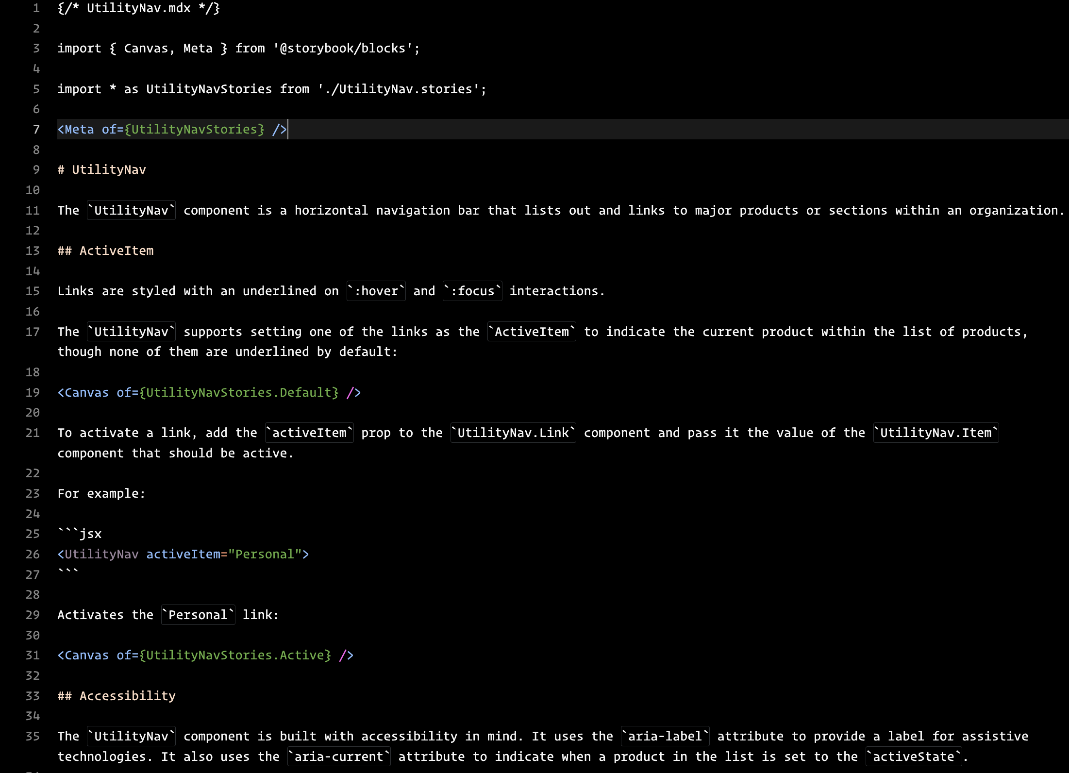
The important bits are at the top. I’m importing Storybook’s blocks, then pulling in the UtilityNav.stories.js file so I can use it in the docs. Then, I’m just writing some useful information in Markdown:
- A description of the component and what it’s used for
- Important functionality details: defaults, how it behaves, how it can be used
- Accessibility details
- A “todo” list of items (not shown here) on the roadmap
I saved this MDX file and reloaded Storybook:
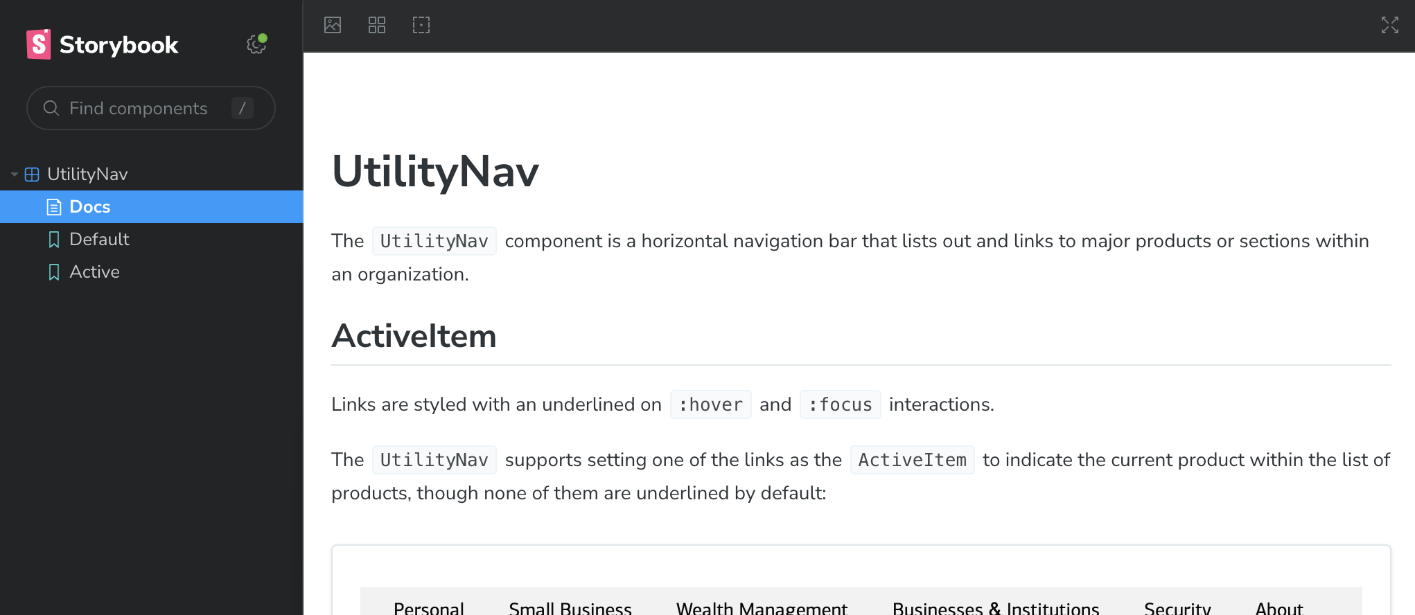
It’s worth mentioning: writing the MDX file made me realize that I only had the one “Default” state, the one with no activeItem. This is helpful to explain, but limited in its usefulness. Engineers need to understand quickly that the one key function of this component is to call attention to the active product. I created a new story called “Active” to show off on example of the active state.
Finally, after a little work, I have a standalone page for my component, with plenty of helpful information for people using it.
Now, it’s just a matter of copying over what I wrote earlier and reviewing it to make sure it answers important questions. Some additional questions I want to make sure I answer:
- How do users import it into their product?
- What features and implementation options do they have?
- What are the limitations of the component?
- Versioning/release information?
- How can I contribute?
- How can I request help or provide feedback?
Some of these questions would be better answered as a standalone page (vs. on a specific component page). I’ll get these into Storybook tomorrow and flesh out what it looks like to collaborate closely with engineering.
—
P.S. If you’ve just joined the list, I’m in the middle of a practical design system build. You can catch up at the beginning of the series here.
—
Cheers,

Up Next: Day 29: Orienting users
Design Systems Daily
Sign up to get daily bite-sized insights in your inbox about design systems, product design, and team-building:
New to design systems?
Start with my free 30-day email course →