Day 32: More token naming considerations
Yesterday, I talked about some token naming strategies. Today, I’m going to decide on the specific names.
A few things to mention up front:
- I’ll be using Token Studio, a plugin for Figma that lets you define and manage tokens. Figma variables are really useful, but the feature is still new and there are limitations that make it difficult to use for production sites. (This recommendation may change in a year.)
- Don’t worry, I’ll cover how (and why) to connect tokens in Figma / Token Studio to your codebase, with diagrams and everything. For now, I’m going to focus on setting them up in Figma.
Let’s jump into this by reviewing our lowly UtilityNav component:
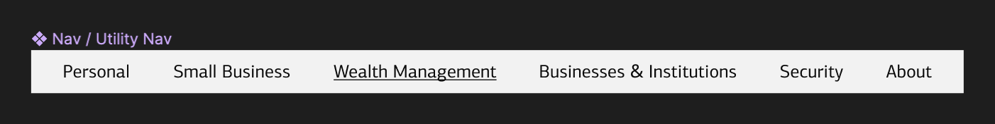
As I learned when I extracted UtilityNav patterns, there are a number of design decisions here:
- component background color
- font color, size, family, and transform
- link color, including default, focus, hover, and active states
- spacing around and between elements on the list
As I said yesterday, I don’t want to tokenize everything. I want to provide small, design decisions that can be integrated for reuse across components.
Remember the rule of three? The same principle can be applied to what to create tokens for. If a design decision is going to be reused in three or more components, it’s probably a good candidate for turning it into a token.
But my example here poses a challenge: I only have one component! What here will be re-used, and what is unique to this component?
And this isn’t a trivial question. Tokens have a way of getting incorporated into your UI over time. If you’re not clear on guidance, you can end up incurring a lot of pain if you ever need to revise them.
Normally, you’d evaluate the rest of the products and choose which styles make the most sense to incorporate more broadly into the rest of your application. Working through other components at the same time can also help you make better decision about which styles are reusable. For the sake of the example, I’m going to simplify the process and start small with these three:
- font size
- link color
- spacing
I’ll start with a range of primitive tokens, some of which can serve as “choices” for the semantic tokens:
color.neutral.0tocolor.neutral.1000spacing.sm→spacing.xl
And then I’ll define some semantic tokens to control the font size and link colors:
font.sm→font.xlcolor.link→color.link.active
There may be a need for more, but I’ll start here. Tomorrow, I’ll set these up in Token Studio.
—
P.S. If you’ve just joined the list, I’m in the middle of a practical design system build. You can catch up at the beginning of the series here.
—
Cheers,

Design Systems Daily
Sign up to get daily bite-sized insights in your inbox about design systems, product design, and team-building:
New to design systems?
Start with my free 30-day email course →