Day 26: A Storybook primer
I wrote a post about Storybook as part of my 30 Days series. It’s long, and I won’t repeat it all, but here’s a quick primer.
Storybook is a tool you can install within web applications to showcase and document code components.
This is what Storybook looks like inside a web application:
In its simplest form, Storybook is a package installed in your app paired with at least one “story” file. Each component in your app is meant to have one of these story files. Here’s an example of what a story file looks like:
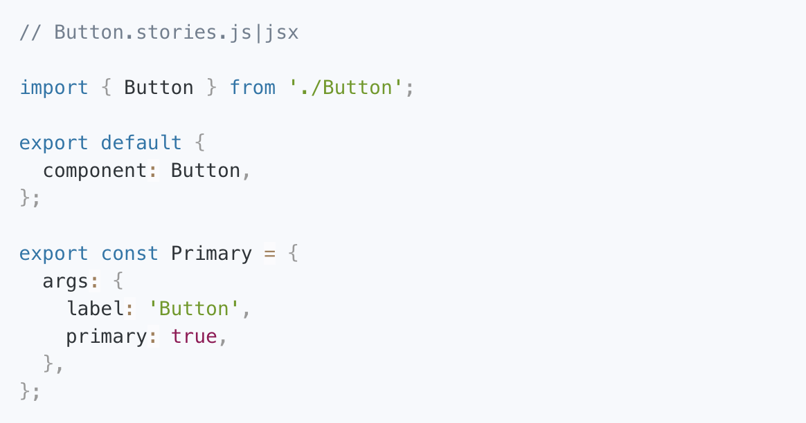
Here’s what’s happening in this particular story file:
- Pull in the app’s button component (and related props)
- Tell Storybook that we're exporting a button component
- Create a story called Primary where the Button component’s
primaryprop is set totrueand its label is set toButton
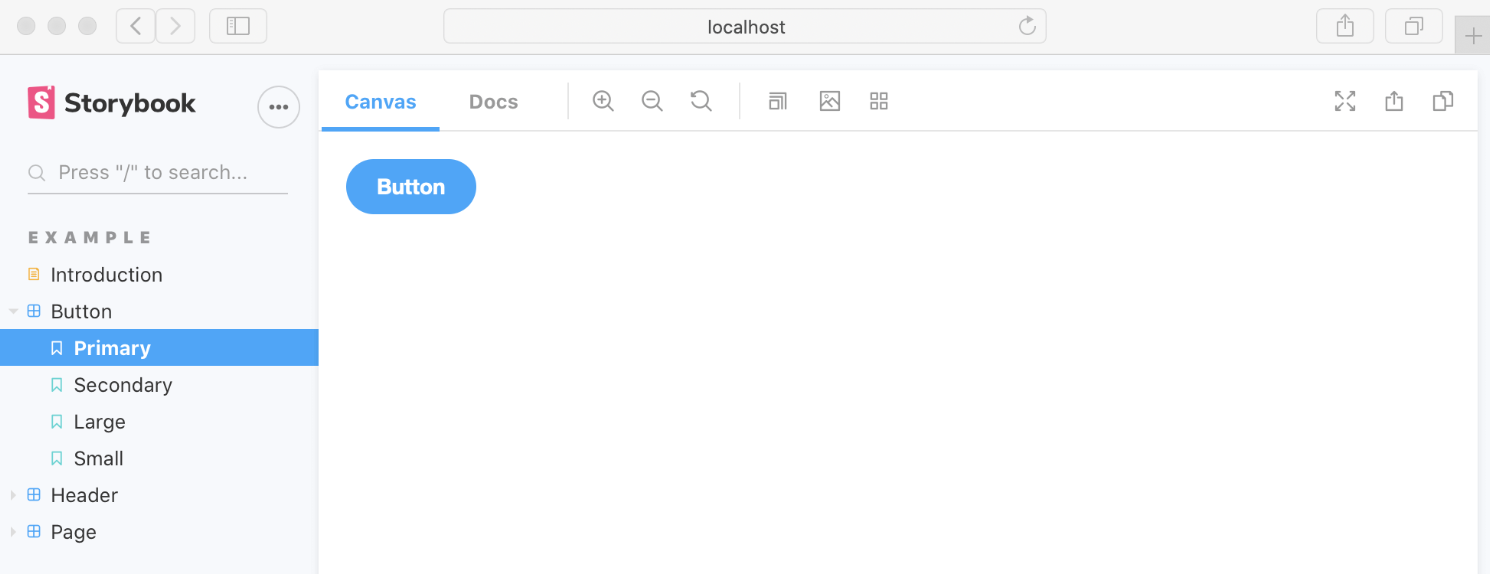
Now, if you were to run Storybook locally, a “Button story” will show up in the Storybook interface, like this:
This is a really useful way to workshop individual components in isolation. You can do things like:
- Showcase important states
- Interact with components on the canvas
- Include usage guidance and documentation
- Test components for significant UI changes or accessibility issues
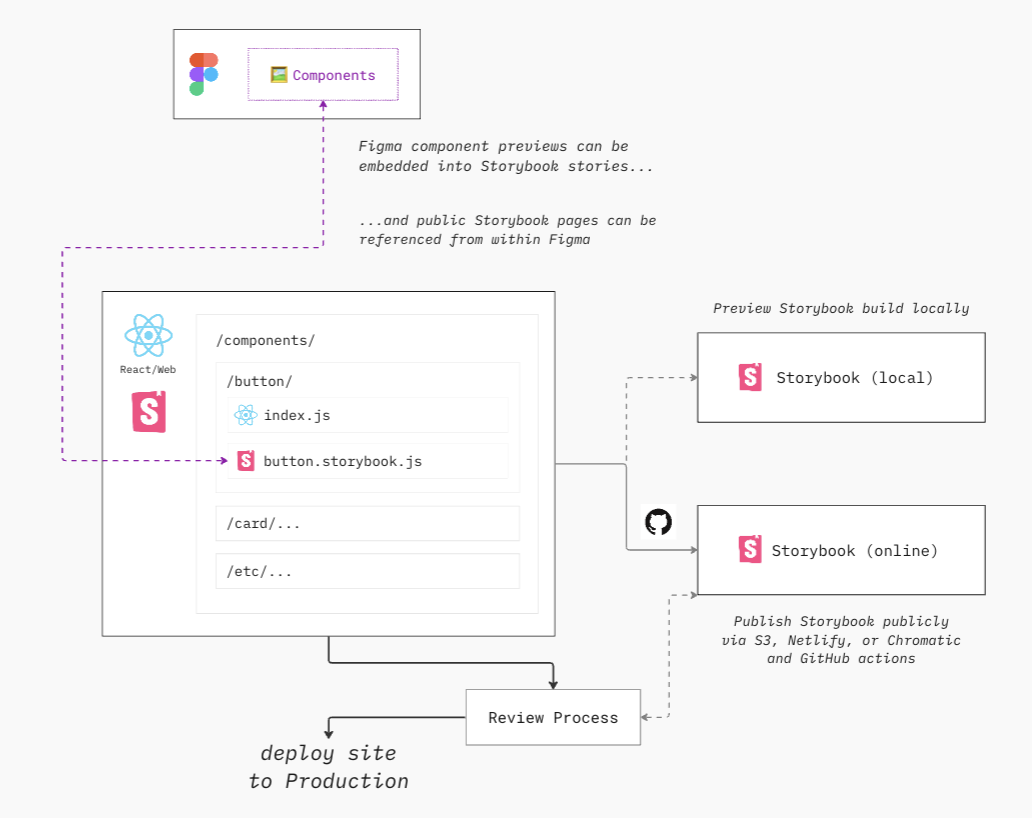
- Link Figma component previews into stories
- Publish Storybook and embed/link component stories from within Figma
This extensibility is one of the reasons why Storybook is so popular.
Eagle-eyed readers will notice a few more “Button stories” in this screenshot: Primary, Secondary, Large, and Small. Hopefully, now you understand exactly how those would get created. You might have also notice an “Introduction” page, a standalone documentation page. More on how to set that up later this week.
…
Let me mention one other important thing that relates to my existing BofA build. (If you’re new, be sure to catch up on the series for the appropriate context.)
My UtilityNav component doesn’t live in any one app, it is now being imported from my component library.
So where should I set up Storybook?
Each app, in theory, could have Storybook set up for its own local components. If it’s a mature app with a solid engineering team, that’s quite possible.
But I’m building a design system. My focused is on creating a library of shared component that can be pulled into apps. So I’m going to set up Storybook inside the shared component library. It will serve as a storefront for other app development teams: here are the components available in this shared library and here’s how they work.
So there’s a quick recap of Storybook and how I’m planning to use it. Tomorrow, I’ll get Storybook installed and configured in my component library.
Cheers,
—
P.S. If you’ve just joined the list, I’m in the middle of a practical design system build. You can catch up at the beginning of the series here.
—
Cheers,

Up Next: Day 27: Setting up Storybook
Design Systems Daily
Sign up to get daily bite-sized insights in your inbox about design systems, product design, and team-building:
New to design systems?
Start with my free 30-day email course →